Dyslexie

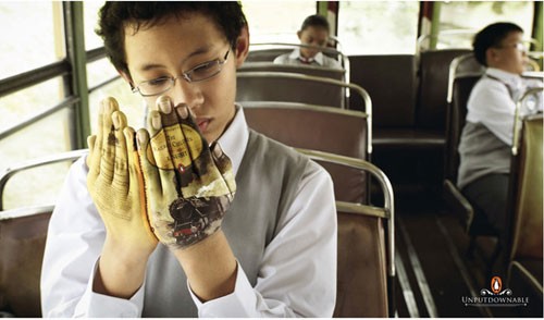
Example of DyslexieChristian Boer designed the typeface Dyslexie because “reading printed text is so fluid and transparent for most people that it’s hard to imagine it feeling any other way. Maybe that’s why it took a dyslexic designer to create a typeface that optimizes the reading experience for people who suffer from that condition.” This link has a description of the typeface and an interesting video about how to make type more readable, even for non-dyslexics.

Sonia Delaunay

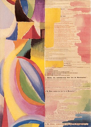
Prose du Transsibérien et de la petite Jeanne de FranceOne of the most famous and earliest artists’ books is Prose du Transsibérien et de la petite Jeanne de France, with a poem by Blaise Cendrars and pochoir illustration by Sonia Delaunay from 1913. I got to see a copy, with all its spectacular color, once at a museum in San Francisco. (See a much larger image here.)
I’ve been working on a mobile recently, which I thought I might pochoir, and I remembered Delaunay’s piece. Turns out there was a recent exhibit of her work at the Copper Hewitt in NYC. The description of the exhibit says, in part, “a trademark of Delaunay’s work is the sense of movement and rhythm created by the simultaneous contrasts of certain colors.” Seems like a good place to look for inspiration for a moving piece like a mobile! Since the exhibit is closed and I’m not in NYC, I had to settle for these happy pictures of Delaunay’s use of color.

House Numbers

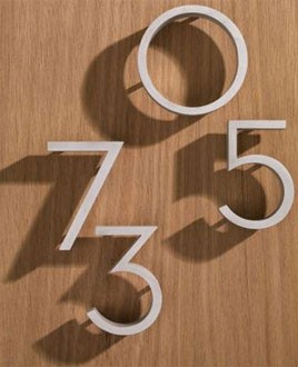
Neutra House NumbersAs my husband and I continue our (seemingly never-ending) house renovation, there are a few really fun decisions to make — as opposed to the current sometimes mind numbing task of painting all the outside window trim. The most recent fun one was selecting house numbers — it was obvious where to put them, but what font to use? I knew I wanted a sans serif font, and quickly found Neutra. I especially like how these sit away from the house. I guess I’m still a California girl or just addicted to mid-century style, as the font was designed by architect Richard Neutra, who “in California, … became celebrated for rigorously geometric but airy structures that symbolized a West Coast variation on the mid-century modern residence.” (You can see the entire font here.)

The Serif Fairy

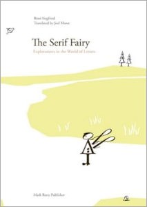
The Serif FairyBembo’s Zoo While looking for something on Amazon, I ran across a typography book for children that was new to me: The Serif Fairy by Rene Siegfried.

“The Serif Fairy has lost her wing, keeping her from performing magic. This book follows her through an airy, immaculately designed typographic landscape as she hunts for it. Along the way, she makes friends and has adventures as she wanders through the Garamond Forest, visits Futura Town and eventually ends her quest at Shelley Lake.”

All the inhabitants and objects in the book are made from glyphs from four fonts: Futura, Garamond, Shelly Script and Zentenar Fraktur. You can see pictures from the book here
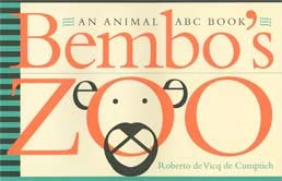
A book I’m more familiar with is Bembo’s Zoo, an abecedarian book where animals are made up only of the letters in their names (using Bembo, of course). You can see many of the illustrations here.