Gill

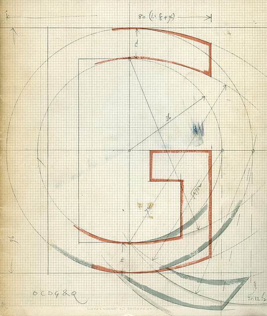
Gill Sans (designed by Eric Gill) is one of my favorite fonts. This photo is marked ‘Part of a drawing for Gill Sans C D G O Q dated 20.12.32. The original is in pencil and colour wash on graph paper and measures 11″ wide by 14.5″ high.’ Reproduced in: The Monotype Recorder, Volume XLI No. 3, Autumn, 1958. Read more about Gill Sans. Photo found here.

Gil Sans

Suzanne Moore’s A Musings

For this year’s Codex, through Instagram, I got to see some books in progress before the fair. Calligrapher Suzanne Moore has a new book called “A Musings,” a book of all embellished A’s. Jessica Spring of Springtide Press letterpress printed one page and posted pictures of the lock-up and printed page — before Suzanne worked on it. Jessica told me she didn’t recognize the pages after Suzanne finished with them! Suzanne laughed when I told her that. The finished book is beautiful — I couldn’t find a snap of the page Jessica printed, but I did find a few other spreads. They are below, after Jessica’s. I asked Suzanne if she was going to do the entire alphabet, and again she laughed and said she’s considering only one other letter: Q.

stp-sm-1.jpg

stp-sm-2.jpg

Suzanne Moore’s A Musings

Suzanne Moore’s A Musings

Lisa Kokin’s Fascimile Series

At Codex, Donna Seager had an intriguing piece by Lisa Kokin called Facsimile Two. Kokin says

I began to make faux pages and page spreads using the trimmed-down zippers that I had snagged at a fabric give-away months before. The first pieces were generic book pages, small, even, single-column blocks, made of just zippers and thread, with no reference to specific texts. After several months, the work entered the realm of specificity when I decided to work from particular books and to incorporate fabric as a substrate.

Below are 2 pieces, and detail on the first. You can see more about how she made them and why here.

Lisa Kokin Facsimile Two

Lisa Kokin Facsimile Two

Lisa Kokin Facsimile Two