 Earlier this year, I started a prompt challenge where I used a word a week to inspire some bookmaking. It was a lot of work, and I gave up in exhaustion after a couple of months. But it certainly generated a lot of ideas and led to several new books. Now I’m going to try a different sort of prompt — specific poems.
 Bear with me while I get to the poem I’m going to try…. I use em-dash (the long one —) when I write out my haiku, but my set of metal Bembo only has the short en-dash, so when I handset Summer in Vermont, I used periods instead of dashes. This fall I finally got around to buying some em-dashes. In the meantime I started drawing the birds that congregate at the bird feeder in my front yard.
Then my Mom sent me some Emily Dickinson poems, notorious for the use of the em-dash. One poem in particular struck me as perfect for a prompt challenge, as it uses bird imagery and plenty of dashes.
Some keep the Sabbath going to Church —
I keep it, staying at Home —
With a Bobolink for a Chorister —
And an Orchard, for a Dome —
Some keep the Sabbath in Surplice —
I, just wear my Wings —
And instead of tolling the Bell, for Church,
Our little Sexton — sings.
God preaches, a noted Clergyman —
And the sermon is never long,
So instead of getting to Heaven, at last —
I’m going, all along.
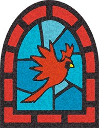
When I think of churches, the first thing that comes to mind is stained glass windows, so my initial idea is to combine windows and bird images — that’s one I did of a bobolink above. I’m not giving myself a deadline on this one, but I’ll keep reporting back as I get more ideas and build models…
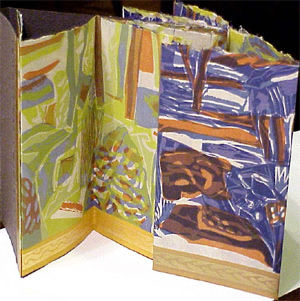 In my small book collection, I have a double-sided accordion book, “Summer Day | Winter Night” where Claire Van Vliet printed Ruth Fine’s linocuts. It’s exquisitely constructed and has some very nice touches. The linocut was printed on several sheets, then connected together, then folded in half horizontally, and finally folded into an accordion. This hides the seams and allows you to make an infinite length double-sided accordion. There’s a small tab at the end of the accordion to facilitate pulling out & unfolding the book. A similar tab folds over the front cover, giving you a hint of what’s inside.
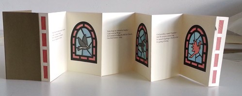
 I’m working on a book with an Emily Dickinson poem in it (see my first post