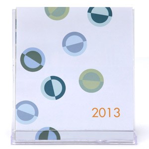
 As it’s after the first of the year, my 2013 desktop calendar is now on sale. It was $22, now $15. Click here to see photos of all the months.
![]()
As it’s after the first of the year, my 2013 desktop calendar is now on sale. It was $22, now $15. Click here to see photos of all the months.
I was looking over Alicia Bailey’s Abecedarian Gallery website the other day and ran across these absolutely wonderful pop-ups by Shawn Sheehy. They are from his A Pop-Up Field Guide to North American Wildflowers. It not only includes the pop-ups, but also “an essay detailing a 21st century ‘Language of Flowers.'” See more pictures here. He’s also selling individual spreads as cards (for sale from Sheehy and from Abecedarian.)


 … ; it rests in the hand; it breathes.
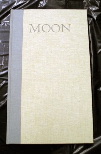
This is Robert Bringhurst’s review of Moon, David Romtvedt’s first book-length collection of poetry, letterpress printed with handset type by Gerald Lange. I thought that line was quite beautiful, and hope I can print a book one day that deserves that sort of praise! You can see a few more pictures here. And read one of Romtvedt’s poets here.
The Book Art Object blog often has nice posts about how the participants made a book or the thinking behind the structure they chose. The other day Alicia Bailey showed a book based on a Hedi Kyle structure called a panorama book. While I couldn’t find directions, several people on the web mentioned this is a derivation on the flag book.


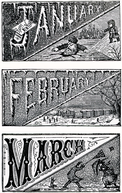
The other day on Letterology, I saw Norman McKnight’s 2013 calendar, which uses 19th century copper blocks for the illustrations (see several of them below). You can see McKnight’s calendar on his blog, as well as lots of photos and notes about type and typography.
After playing around with a folded double-sided accordion for a while, it dawned on me that the 2 poems were short enough to do the accordion with a single sheet (thus no bulky seams). While I liked the idea of the double folded accordion, Mohawk Superfine doesn’t fold very well in the non-grain direction (it cracks). The Mohawk sheets I have are 25″ long in the grain direction, and I laid out the pages and artwork so that it would all fit in that length. Here’s what I did for this model…
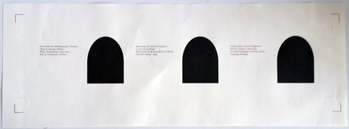
![]() This is the sheet before cutting. It’s printed on my ink jet. The black areas are for the stained glass windows. The L-shaped registration marks on the ends are for the cutting plotter. For this model, the back of the sheet is unprinted, however if I editioned this book, I’d letterpress print the second poem on the back.
This is the sheet before cutting. It’s printed on my ink jet. The black areas are for the stained glass windows. The L-shaped registration marks on the ends are for the cutting plotter. For this model, the back of the sheet is unprinted, however if I editioned this book, I’d letterpress print the second poem on the back.
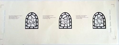
Here’s the sheet after cutting.
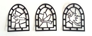 The next step is to print the windows on rice paper, and glue them to the back in the correct spots. Then cover the windows on the back with another cutout—made of thin black paper. I think of these cutouts as the lead in the stained glass–there they are to the right.
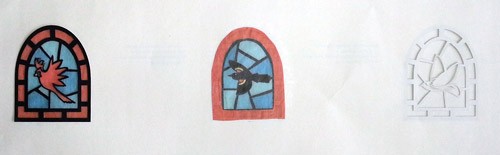
The picture below shows the back in progress. The left-most bird is covered by the tissue and the black cut out, the middle one just has the tissue, and the right-most has nothing.
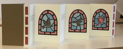
Once the windows are finished, I trim the paper, fold the accordion and attach the cover. Here’s the finished front:
the back

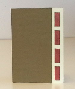 To make the book work in one 25″ long sheet, I sized it at 3-1/2″x5-1/4″. This is the cover. There’s a tab at the end of the accordion with the same detail as the cover decoration, but it’s loose & facilitates pulling the folds out. (You can see this tab in the photos above–it’s next to the red bird.)
![]() Making models helps me in numerous ways. I’ve made 6 so far for this project and suspect there will be a few more. It can be tedious, but with each one I see something to improve or change as well as understand more about what it would take to edition the book.
Making models helps me in numerous ways. I’ve made 6 so far for this project and suspect there will be a few more. It can be tedious, but with each one I see something to improve or change as well as understand more about what it would take to edition the book.
![]() I’m pleased with this model—it folds well and I quite like the way the light comes through the windows. Yet to be worked on: the cover paper I chose is too flimsy and something beefier is called for.
I’m pleased with this model—it folds well and I quite like the way the light comes through the windows. Yet to be worked on: the cover paper I chose is too flimsy and something beefier is called for.