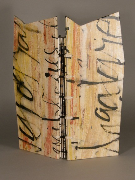
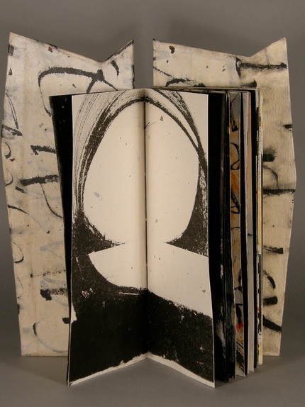
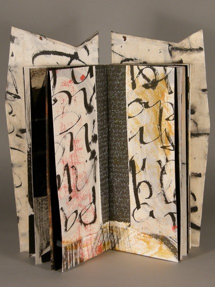
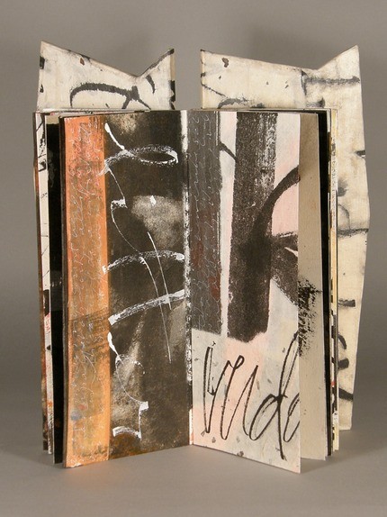
I recently met Laura Wait, a calligrapher and book artist here in Santa Fe. She showed me a video of her latest book—she’d made it by setting up all the pages on a table and walking slowly around the table using her iphone to capture them. The pages weren’t in order yet, but it was a wonderful eyeful. I don’t really make books like that (mine have a specific order from the beginning), but I have often wanted to show a mockup to someone and don’t have a good way to do that when they aren’t here in Santa Fe. I’m going to experiment with making a video of turning the pages of a book I’m working on and see how that pans out. In the meantime, here are some pictures from Laura’s book Artis Litterarius (the art of words). She says it’s an homage to words, with covers like altar pieces. The words she’s used concern writing and parts of something (snippet, palimplsest). See all the pages in the book here or check out her website or her books on Vamp & Tramp.
What do you think about Pantone’s 2014 color of the year? They call it Radiant Orchid. The Pantone Color Institute says “People associate purple with creativity and originality.” An article about it is here.
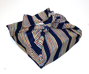
I’ve been reshuffling my studio, to make room for a laminating press I recently bought, and I had to find a new home for one of my prize possessions—a lovely piece of fabric given to me by Kumi Korf. It’s the kind of wrapping cloth she uses to transport her books. I’ve long forgotten the name of the wrap, but that very same day, I read a post entitled An Offbeat History of Wrapping Paper which mentions this Japanese wrap
Take the eco-friendly Japanese wrap, the furoshiki. These lovely, reusable cloth wrappers were originally used to bundle up personal effects while visiting public baths. Gradually, they broadened in use to an all-purpose wrap, including concealing gifts. Furoshiki date back to at least the Edo period (1603–1868) and combine a beautiful concealment with portability and craft.
And it mentions a youtube video that elegantly shows the many ways to tie up furoshiki into a bundle. The photo is my own furoshiki, carefully protecting several of my books.
A bit of fun for a chilly afternoon: The other day on the book arts list someone asked about identifying the title font in this image
Rather quickly, someone responded “WhatTheFont identifies this font as “Dexterous” which is a new design based on an “antique typeface” (unnamed). The lowercase r is somewhat different, but the other letters are very similar.”
So I found What the Font to check it out. I had to edit the image to capture just the title, change the contrast/brightness in order to make the letters darker, and rotate the line a bit to make it straight, like so:
Here’s the results
Along the side of the results were a list of “related tags” that seemed useful: Art Nouveau, sans-serif, French, soft, rounded, gothic, clean, American, retro, ornamental. And at the bottom, it said ” No good match? Submit your image to the WhatTheFont Forum to have your image viewed by font geeks the world over. Or try Identifont to identify your font by answering a series of questions about the letter shapes. For more fun, I tried Identifont as well, but didn’t get very far because the questions assume you have the entire font (the first one asks about upper-case Q, second about $, third about upper-case M… none of which I have). Here are links to Dexterous and Art Gothic URW, the first 2 fonts on the list above.
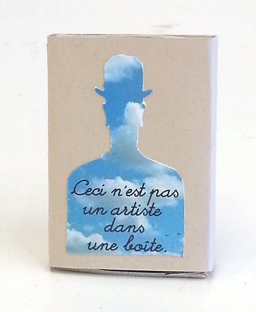
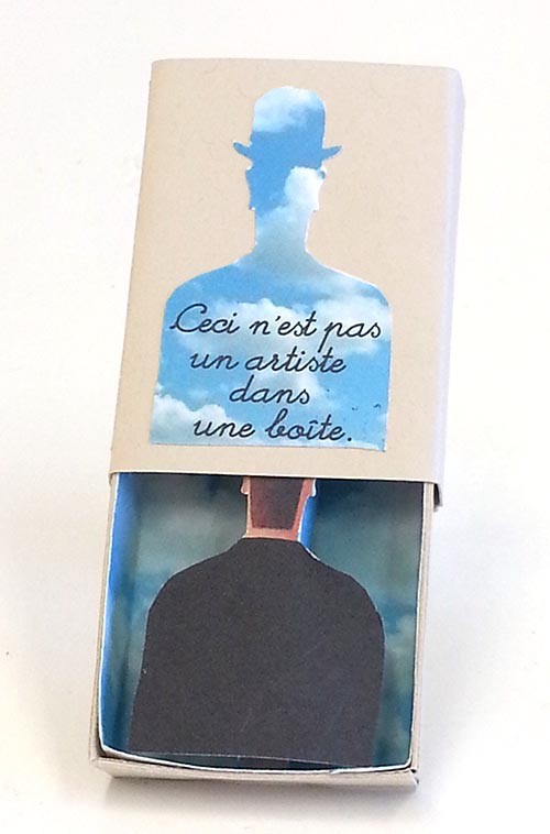
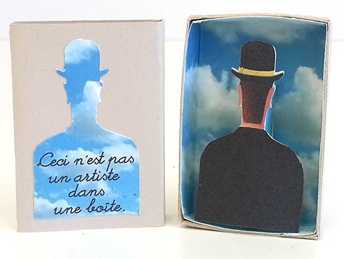
After making a Magritte matchbox for my last word group meeting, I wasn’t quite done with Magritte. My sister suggested that I consider Magritte for my “artist in a box” series, maybe using “This is not an artist in a box.” Here’s what I did with that idea, based on this Magritte painting called “Decalcomania”
Recurring images in many Magritte paintings are a blue sky with puffy white clouds and a guy in a bowler hat. Here’s my matchbox for Magritte:
The December word for my book group was appropriate for the holiday season: coruscate
verb: to emit vivid flashes of light; sparkle, scintillate, gleam, a striking display of brilliance or wit
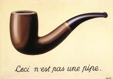
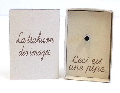
The books people brought to our meeting were quite diverse. One was a book made of scraps of joss paper, painted mylar, and other bright paper, full of memories about the projects that used those paper. Another was a riff on “golden,” like golden child, golden rule, golden apple… And one person brought all the “bright and shiny” books on her book shelf, many artists books that she found witty and brilliant. Since I’ve been thinking about “artist’s in a box” as a theme for making my matchboxes, I thought I’d concentrate on an artist that had “striking displays of brilliance or wit.” My first thought was Magritte, with his painting “La trahison des images” (The Treachery of Images), about which Magritte said
The famous pipe. How people reproached me for it! And yet, could you stuff my pipe? No, it’s just a representation, is it not? So if I had written on my picture “This is a pipe”, I’d have been lying
Here’s my response to Magritte’s painting:
A couple of notes about making this…
+ The reaction from my group was that some didn’t recognize the metal thing sticking out of the box as a “pipe.” My husband suggested that I bend the metal to a sort of curved L shape.
+ After I was done, I belated thought “Does ‘pipe’ have a double meaning in French, as in English” — is “pipe” the word for both the thing one smokes and a conduit of water. Turns out no, the word for “conduit” in French is “tuyau” Maybe I should have written the words in English (This is a pipe) rather than French? Anyone have anything to say about this?
+ Lastly, the font. Magritte’s words are hand-written on the painting, and I used them for the inside of the box. But the title on the cover? I found a similar (free!) font—Little Days—which had the same p (which I thought would be the hardest to replicate).

 I’ve been reshuffling my studio, to make room for a laminating press I recently bought, and I had to find a new home for one of my prize possessions—a lovely piece of fabric given to me by