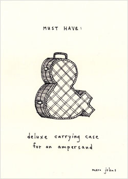
After all those ampersands from yesterday’s post, I thought this illustration by Marc Johns was appropriate.
![]()
After all those ampersands from yesterday’s post, I thought this illustration by Marc Johns was appropriate.
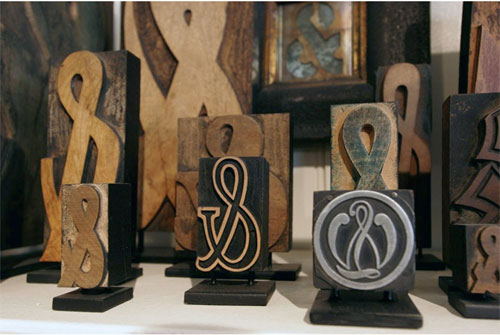
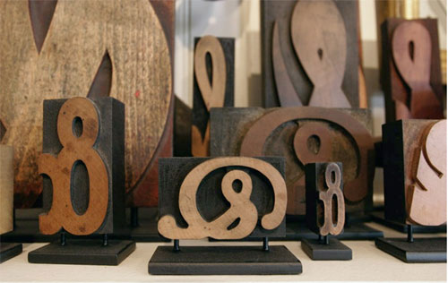
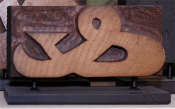 On a blog dedicated to ampersands I found a post about a collection from East Market Street Antiques in NY and couldn’t resist posting the pictures. I though I had a pretty big collection, but nothing like this! They are mounted on “museum stands,” and I’m undecided if I like that… She also has a collection of question marks and exclamation points — all for sale.
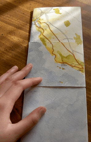 The other day my friend Cathy sent me to Britta Gustafson’s blog post about her flexagon — a map of three summers in the Bay Area. [If you don’t know about flexagons, they are similar to Jacob’s Ladder toys — flat “books” made from folded paper that are then unfolded, or flexed, to reveal a number of hidden faces. Wikipedia gives the history and probably more than you want to know…] Britta’s post has great pictures plus an animation toward the bottom showing the various panels on the book. Cathy knew I’d like the post because it’s both map & book related. I like that each flex of the flexagon becomes more specific.
![]() Cathy’s email reminded me about the “10 Books in 2 Days” classes Cathy organized several years ago to celebrate the 10th anniversary of the San Francisco Center for the Book. She set up 5 stations a day, each with a different book structure or printing method and different instructor; participants rotated through the stations doing each activity. I was charged with designing a flexagon that participants could make. I found two resources that were a great help — Ed Hutchin’s instructions that number the panels so you can tell if you’ve made the thing correctly when you try to flex the panels, and the Flexagon Portal with more instructions and videos and how-tos for making various shaped flexagons. Ed also has a page of examples with pictures of all the panels.
Cathy’s email reminded me about the “10 Books in 2 Days” classes Cathy organized several years ago to celebrate the 10th anniversary of the San Francisco Center for the Book. She set up 5 stations a day, each with a different book structure or printing method and different instructor; participants rotated through the stations doing each activity. I was charged with designing a flexagon that participants could make. I found two resources that were a great help — Ed Hutchin’s instructions that number the panels so you can tell if you’ve made the thing correctly when you try to flex the panels, and the Flexagon Portal with more instructions and videos and how-tos for making various shaped flexagons. Ed also has a page of examples with pictures of all the panels.
![]() If you’d like to try to make one, download this PDF of “A Bookmaker’s Bag ‘o Tricks” flexagon I designed for Cathy’s event. It’s 2-sided and has 2 flexagons. The top half is for practice, with the numbers as on Ed’s instructions. Once you’ve mastered the folding, use the bottom half to make the flexagon.
If you’d like to try to make one, download this PDF of “A Bookmaker’s Bag ‘o Tricks” flexagon I designed for Cathy’s event. It’s 2-sided and has 2 flexagons. The top half is for practice, with the numbers as on Ed’s instructions. Once you’ve mastered the folding, use the bottom half to make the flexagon.
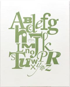
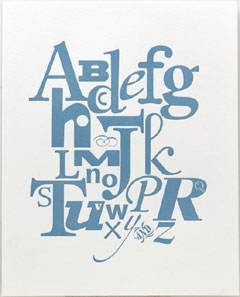
 The biggest print I can make on my platen press is about 8×10. I’ve been itching to do something larger, but fitting a bigger press in my shop just isn’t practical. So I decided to try out the Vandercooks at the San Francisco Center for the Book where I teach. These are cylinder presses and I’ve only used them a few times. I arranged to print the same day as my friend Melissa, who had agreed to give me a quick refresher — how to clean the press, differences to watch out for between a platen and cylinder model. I took with me a design I’d done but had trouble printing on my own press — it fits on an 8×10 sheet but the image area is too big to get good ink coverage from my platen. The Vandercooks printed it beautifully — with a nice deep impression, so the Q and V and dot of the I in the prints below stand out. I especially like this design because I got to use the “AND” from the Adobe Wood Type Ornaments! I printed some in 2 different colors and they are available here.
![]()
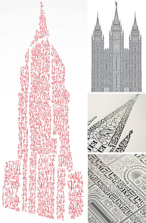
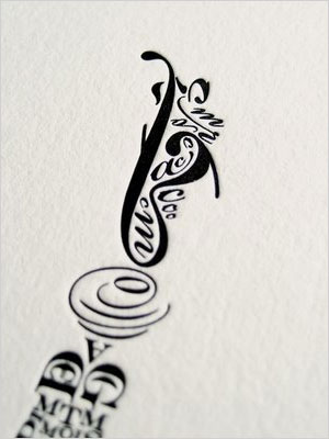 Veer’s playful typeface catalog is called Type City: A Visitor’s Guide — along with examples of their types they include whimsical illustrations of buildings and cityscapes made of type (see the red “Bringhurst Hotel” below). Inspired by the catalog, Cameron Moll designed an elaborate print from Bickham Script, Engravers MT and Epic of the Salt Lake Temple in Utah (detail of the top of the spire on the left, then more below). Photos showing the printing are here. The Veer catalog PDF is available here. And the print is for sale here.
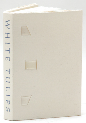 A favorite in my collection is White Tulips, ninety-nine haiku by Ronald Baatz. Leonard Seastone of Tideline Press in upstate-New York designed the book, which he handset in Elizabeth and Carolus type and then letterpress printed on dampened, vintage Barcham Green Hayle paper. Single and fold-out pages alternate throughout the book, with the fold-out ones hiding more haiku for the reader to discover. There are 3 cream-colored strips of ribbon in the binding that make the cover even more beautiful.
![]() Baatz writes the sort of haiku I aspire to:
Baatz writes the sort of haiku I aspire to:
shadows of branches
like dark roads
on winter’s snowy mapnew clock ticks louder
than the old clock ever did
this for ten dollarsclothespins —
like skinny wooden birds
on the line
The Poetry Dispatch blog has written a bunch of posts about Baatz that include both haiku and longer poems. One of the posts quotes Norbet Blei on Baatz: “(he) sees the big picture in small, seemingly simple poems; publishes in obscure, small presses; appears invisible in today’s world of raucous voices. Silence. Every poem is a new awakening to an old truth we seldom find the words to say or see. His work is difficult to locate but worth the search. He lives in Mt. Tremper, NY. There he goes now…”
mountains disappear in fog
and i want to go right along
with them
And White Tulips is available from Joshua Heller.