 A few weeks ago, Marty Weil asked to interview me for his blog, “ephemera: exploring the world of old paper.” On Etsy, the tag line for my shop is “Green Chair Press: letterpress, books, ephemera,” but formulating answers to his questions made me think anew about “ephemera” and if I really made such a thing. The current common definition seems to be paper items — posters, broadsides, tickets and the like — that were originally meant to be tossed after use but along the way become collectibles. Saying I make things that are too good to throw away does seem a bit presumptuous! You’ll find more of my musings if you read the interview here.
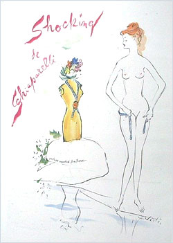
 Finding an illustration for this post was a challenge! So I resorted to my own “ephemera” collection — perfume bottles (I wrote about them and collecting here) — including several ads torn from old Vogue magazines. That’s one of them to the left, illustrated by Marcel Vertes, from 1949.