 I’ve been too busy with other stuff recently to think much about my own bookmaking projects. Last month my computer died unexpectedly (isn’t that always the way it works?) and I had to get a new one with an updated operating system. For a while it looked like I wasn’t going to convince my very old but much loved inkjet printer to work with my new setup and as I looked at large format inkjet printers as replacements, I began dreaming up new projects to try. But after more cajoling, my faithful printer is working again, so why spend the money and (much worse) considerable learning time on a new one?
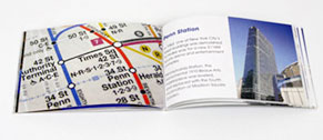
 But there must be something in the air, because small nudges to work on something new seem to happen every day. Yesterday my friend Kate sent a link to a contest at Lulu: Create a Mini Photography Book. Win $500. Even if I don’t enter the contest, their new mini books have interesting possibilities. They have 2 sizes, 3.75×2.5 and 5.25×3.5. The smaller one is $3.99 each for a 20 page book, and I probably couldn’t make a small edition for that price (see all the details here).
And then came a call for entries for Broadsided! The Intersection of Art and Literature, an exhibition of letterpress printed broadsides in October in Portland…. guess I better get busy!
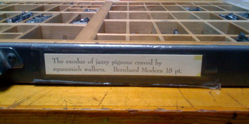
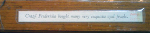
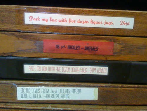
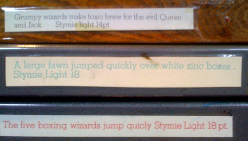
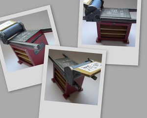 On the day that John Sullivan (the president of PCBA) mentioned to me that this year is the 100 anniversary of the Vandercook proofing press and that he’s getting together an article celebrating the anniversary for an upcoming Ampersand, I saw a link to this nifty paper-folded printing press. It sort of looks like a Vandercook (it’s actually a “Korrex Newspaper Printing Machine”) And best of all the bed of the press has locked-up type and there’s a printed two-up spread on the feedboard. I’ve download it and have it mostly cut out — I’ll put it together after supper tonight.