Ascenders & Descenders

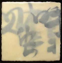
Ascenders & Descenders is a typographic reinterpretation of Merce Cunningham’s dancing hands. From this blog:

The piece is a Cunningham dance work reconstructed from textual deconstructions of other Cunningham dance works. Each finger has an associated excerpt from an article, review, or essay on Cunningham from the last 5 decades. These texts become the “ink” with which each finger manifests its movements. Each text is dynamically typeset in 3 dimensional space along the curves traced by his fingertips.

What, from the outside, appear to be subtle manipulations of the hands become a beautiful tangle of diving flocks and waterfalls of letters. Presenting dance in this way, we hope to get closer to the experience of the dance from the inside out.

Taking a line for a walk…

Chris Paschke EncausticThe other day I met my friend Sharon at the San Francisco Main Library to see the Friends of Calligraphy triennial member show. I was prepared to see beautiful lettering, which I did, but there was a lot more. There was Chris Paschke’s encaustic piece, right, which I wanted to reach through the glass and touch. There were also cut paper pieces, a chiseled alphabet, a very delicate, precise paper casting, illustrated books, and illuminated letters. There were quotes and poetry of all kinds, some legible, some not (but still wonderful to look at).
I wrote down the names of a lot of the calligraphers, so I could look up their work at home. I’ll be writing about them in the upcoming days. The title of this post is a quote by Paul Klee, mentioned by one of the exhibitors in her statement about her work and her mark-making. (Klee was a master draftsman, and many of his works are elaborated line drawings; he described his technique in these drawings as “taking a line for a walk.”)
The exhibition continues at the library until Aug. 23 and you can also see photos of some pieces in the exhibition at this flickr stream.

Spring 2009 Ampersand

Spring 2009 AmpersandThe Spring 2009 Ampersand has just come out. (That’s the quarterly book arts journal I edit for the PCBA.) It’s got the third of three articles on papermaking by Ginger Burrell where among other things she writes about printing directly on handmade paper using an ink-jet printer and Golden Digital Grounds. One of the problems with ink-jets is that they really only print well on coated papers. Digital Grounds is an ink-receptive coating that can be applied to a variety of substrates, making them more amenable to ordinary ink. You can read more about it here.
You can see back issues of the Ampersand here.

Marking Time

“Marking Time” is the theme of the current triennial Guild of Book Workers members’ exhibition. The PCBA had a member exhibition with the same title in 2005 — our theme was a bit more restrictive with the exhibition exploring “how book artists have used the calendar structure to think about the cycles of the year…” We also published an Ampersand at the same time with a more expanded focus, including articles about book artists who used dreams and time in their bookworks.
I’ve been thinking this week about my design for a 2010 calendar (and how much should it be like a conventional month-by-month affair) and “marking time” has been on my mind. So it was with special interest that I looked at the online version of the GBW show. All are beautifully photographed and there is a short artist’s statement accompanying the photos. One that made me smile is Todd Pattison’s Little Library. How does it relate to the theme you might ask? Pattison says, “working on this piece allowed me to bind the same number of books in one night that would otherwise take a year or more.”

Todd Pattison’s Little Library

Moveable Type

This is a video of “Remember,” an installation by John Powers that makes music with old typewriters. The video is from the Universtiy of Alabama website. Power’s has another video and more photos on his own website (it doesn’t have the background music so you can really hear the typewriters playing).

Use the best available ampersand…

… or so says Robert Bringhurst in The Elements of Typographic Style. He also says

Since the ampersand is more often used in display work than in ordinary text, the more creative versions are often the more useful. There is rarely any reason not to borrow the italic ampersand for use with roman text.

My recent computer woes are boring even to me so suffice it to say that over the past week I’ve been forced into a lot of digital house cleaning. As I hunted around for what I might do to get my various blogs and websites to use less bandwidth, less disk space, less memory and to load faster, I happened on this post about coding web pages to use “the best available” ampersand (that’s where the opening quotes come from). Of course I side-tracked myself completely by reading the entire post, plus comments, and clicking on lots of links (like Robert Rutter’s The Elements of Typographic Style Applied to the Web. ) But I think it would be over-kill (even for me) to have the desktop wallpaper of ampersands mentioned at the end of the post — especially in all black! — see below (or go here for every format imaginable).

Ampersand Desktop