This is the second post on my experiment comparing making a print-on-demand mini book with making a similar book by hand.
 My first task was to reformat the original book and condense it a bit — it was 22 pages and needed to be 20. I’d read some comparisons of print-on-demand services, and Lulu, the service I’m trying, allows you to upload a PDF of the book pages, so you can use your own fonts and page layout software. All of the others require you to use their software and limited set of fonts to layout your book. I particularly wanted a full bleed and a book that opened flat, and the example photos of mini-books on Lulu’s website (picture above) indicated they would do that. So I laid out my book in InDesign and made a PDF….
Once I got to Lulu, though, I quickly discovered that my information was wrong — to make mini books (or any of Lulu’s “photo books”), you have to use their software (a flash program called Lulu Studio). So I went back to my PDF, read it into Photoshop and exported the pages as JPGs to import into Lulu Studio.
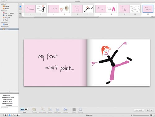
Uploading and arranging my JPGs into a book was easy. But the preview had me stumped. In one window, you see a large double-page spread you are working on while along the bottom there’s a scrolling window with small versions of the spreads. Here is the large double spread…
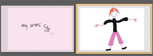
 What is that dotted lined rectangle and gray area around my images — does that indicate the trim or something else? I made the JPGs over-sized (1/16″ larger on all sides than the book to ensure the pink bled off the left pages), so why didn’t the images fill the preview? The second smaller preview looked more like what I thought I should see (that’s it to the right).
I popped over to the Lulu forums to see if there was an answer (no). I’ve emailed Lulu support (but several days later I’ve not gotten a reply).
Annoyed, I hunted around to see if other print-on-demand sites made similar small books. I quickly discovered that iPhoto, the Mac program, also lets you make photo books — they have one that is roughly the same size as the Lulu mini book (3-1/2″ x 2-5/8″ and also 20 pages). So for the moment I’ve shelved Lulu and am off to make an iPhoto book….
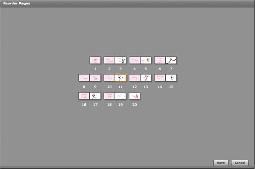
One more small annoyance about Lulu’s layout program: you can reorder the pages, but the display is so small, it’s useless (see screen snap below). I ended up starting over when the pages were in the wrong order — I couldn’t figure out which pages to swap because I couldn’t read the type…
 This is the fourth post on my experiment comparing making a print-on-demand mini book with making a similar book by hand.

 From the article by John Carlos Cantu: