 |
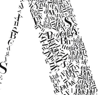
Ryan Beshara’s Modern Pop shop recently listed this nifty alphabet poster called “Alphabet Soup.” She also has prints of numbers and letters.
|
![]()
|
Ryan Beshara’s Modern Pop shop recently listed this nifty alphabet poster called “Alphabet Soup.” She also has prints of numbers and letters.
|
 This is the seventh (and final) post on my experiment comparing making a print-on-demand mini book with making a similar book by hand.
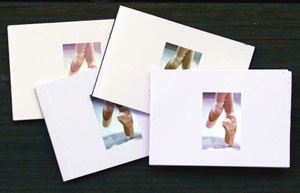
![]() For my experiment, I made 4 books, all approx. 3.75″x2.5″, using 2 print on demand companies — Lulu and Apple (via iPhoto) — and 2 completely handmade — one using double sided photographic (coated) paper, the other with a non-coated text-weight paper. Is it cheaper and easier to print and assemble an edition of these small books by farming it out to a company like Lulu?
For my experiment, I made 4 books, all approx. 3.75″x2.5″, using 2 print on demand companies — Lulu and Apple (via iPhoto) — and 2 completely handmade — one using double sided photographic (coated) paper, the other with a non-coated text-weight paper. Is it cheaper and easier to print and assemble an edition of these small books by farming it out to a company like Lulu?
![]() Below is a table comparing the books and production costs.
Below is a table comparing the books and production costs.
| cost | paper | construction | lies flat | max pages | |
| Lulu | $5.45 | slick/coated | glued | no | 100 |
| iPhoto | $6.02 | slick/coated | glued | no | 20 |
| photo paper | $3.63 | matte | sewn | yes | unlimited |
| text weight | $3.63 | matte | sewn | yes | unlimited |
| Sold on Lulu | $0.00 | slick/coated | glued | no | 100 |
NOTES:
There’s one last criteria for my experiment: I showed the 4 books to several people and asked their opinion of the paper, construction, and feel. Each said they liked the iPhoto book best — the slick coated paper made the colors pop and they expected that sort of paper in a picture book, rather than a paper that might be in a book of text only. Lulu’s book was everyone’s second choice, but it was obvious to all that it was inferiorly made. The fact that the books didn’t lie flat concerned only me!
![]() What’s next? Sadly the iPhoto book is too expensive to produce and then resell — I doubt I can get more than $10 per copy and the markup really should be 50% to cover my costs to market, store, etc. the book. It’s too bad the Lulu books didn’t work out, as they are on the cusp of being affordable. I may make a few handmade ones using photo paper and list them in my Etsy store and see how they do. I’m also going to think about what sort of larger dimension book I could make using Blurb — my current work doesn’t really suit their photo book format, but it’s an interesting challenge.
What’s next? Sadly the iPhoto book is too expensive to produce and then resell — I doubt I can get more than $10 per copy and the markup really should be 50% to cover my costs to market, store, etc. the book. It’s too bad the Lulu books didn’t work out, as they are on the cusp of being affordable. I may make a few handmade ones using photo paper and list them in my Etsy store and see how they do. I’m also going to think about what sort of larger dimension book I could make using Blurb — my current work doesn’t really suit their photo book format, but it’s an interesting challenge.
 This is the sixth post on my experiment comparing making a print-on-demand mini book with making a similar book by hand.
![]() After my disappointment with the books I made on Lulu, I opened the box containing my iPhoto-made books nervously. Happily they were an order of magnitude better! You have to buy 3 iPhoto books at a time ($11.97 + shipping). Each book came wrapped in a resealable cellophane sleeve. There’s no Apple or iPhoto logo on the back (although the back cover and inside cover pages are all white — doesn’t seem to be a way to put your artwork on those pages, unfortunately).
After my disappointment with the books I made on Lulu, I opened the box containing my iPhoto-made books nervously. Happily they were an order of magnitude better! You have to buy 3 iPhoto books at a time ($11.97 + shipping). Each book came wrapped in a resealable cellophane sleeve. There’s no Apple or iPhoto logo on the back (although the back cover and inside cover pages are all white — doesn’t seem to be a way to put your artwork on those pages, unfortunately).
![]() The big problem is that the book doesn’t really lie flat — the first half of the book has an approx. 1/4″ gutter, while the back half pretty much lies completely open. Since I didn’t take the gutter into account in my artwork, the immediate visual result is that the text, which should be centered on the page, isn’t quite. So if I’m going to print these again, I’d re-do my images to compensate. It also looks like the entire book should have the gutter, not just the front half. With only 3 books as a sample, I can’t tell whether this is a flaw in the production of only my books or all mini-books.
The big problem is that the book doesn’t really lie flat — the first half of the book has an approx. 1/4″ gutter, while the back half pretty much lies completely open. Since I didn’t take the gutter into account in my artwork, the immediate visual result is that the text, which should be centered on the page, isn’t quite. So if I’m going to print these again, I’d re-do my images to compensate. It also looks like the entire book should have the gutter, not just the front half. With only 3 books as a sample, I can’t tell whether this is a flaw in the production of only my books or all mini-books.
 This is the fifth post on my experiment comparing making a print-on-demand mini book with making a similar book by hand.
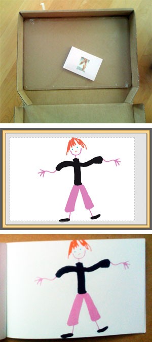
![]() The book I made using Lulu arrived the other day (this post relates my experience laying out the book). You can’t just buy one mini-book, you have to buy them in multiples of 4 (or $15.96 + shipping). They arrived in a ridiculously large box looking very forlorn.
The book I made using Lulu arrived the other day (this post relates my experience laying out the book). You can’t just buy one mini-book, you have to buy them in multiples of 4 (or $15.96 + shipping). They arrived in a ridiculously large box looking very forlorn.
![]() And right they should look unhappy, as I was too when I opened the books. If you remember I was confused by the Lulu layout software and what the preview was showing me. After I ordered my books, a Lulu staff member answered the forum queries about this, confirming my assumption: “This is where you can expect the printer to trim the page. For this reason you should not put important text and/or images in this area [outside the rectangle].”
And right they should look unhappy, as I was too when I opened the books. If you remember I was confused by the Lulu layout software and what the preview was showing me. After I ordered my books, a Lulu staff member answered the forum queries about this, confirming my assumption: “This is where you can expect the printer to trim the page. For this reason you should not put important text and/or images in this area [outside the rectangle].”
![]() The image to the left is the Lulu preview with a dotted rectangle — anything outside that area might be trimmed. So I kept the parts of my images that mattered inside the rectangle. A photo of the book that arrived is below the preview — they trimmed inside this “safe area.”
The image to the left is the Lulu preview with a dotted rectangle — anything outside that area might be trimmed. So I kept the parts of my images that mattered inside the rectangle. A photo of the book that arrived is below the preview — they trimmed inside this “safe area.”
![]() And, unfortunately, that’s not all. The spreads are badly folded, so that the left-hand page is not completely pink, but has a white stripe (different width on every page) at the gutter. And the Lulu logo is emblazoned on the back of the book — can’t remove it or put my own logo. Finally, the preview that is available after the book is “published” — authors use this to promote their books, so prospective buyers can see inside the book before buying — shows the trim as about 1/4″ above and below the dotted rectangle. WYSIWYG it isn’t.
And, unfortunately, that’s not all. The spreads are badly folded, so that the left-hand page is not completely pink, but has a white stripe (different width on every page) at the gutter. And the Lulu logo is emblazoned on the back of the book — can’t remove it or put my own logo. Finally, the preview that is available after the book is “published” — authors use this to promote their books, so prospective buyers can see inside the book before buying — shows the trim as about 1/4″ above and below the dotted rectangle. WYSIWYG it isn’t.
![]() The books arrived last Friday (Jul 17) and over the weekend I submitted their complaint form stating the printing had gone awry, including pictures of the bad trim and gutter problems. After 5 days, I haven’t heard a peep back.
The books arrived last Friday (Jul 17) and over the weekend I submitted their complaint form stating the printing had gone awry, including pictures of the bad trim and gutter problems. After 5 days, I haven’t heard a peep back.
![]() My conclusion: lousy production, lousy customer service, bad product. I won’t be making another book with them.
My conclusion: lousy production, lousy customer service, bad product. I won’t be making another book with them.
 Before desktop computers became prevalent, artwork was prepared by hand with 2 ways to do lettering — hand-written or transfered from pre-printed sheets (usually by rubbing the letters off the sheet onto the artwork). The generic name for these sheets is “letraset,” although it’s also the name of a company in England that still makes the sheets. There were other companies, like Mecanorma, that also made dry-transfer lettering (see these photos of vintage lettreset sheets on Flickr.)
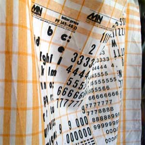
![]() Karin Röling, who runs stiksel and is a graphic designer in the Netherlands, makes tea towels with Mecanorma sheets screen printed on them, as well as other type-infused things like pillows and dolls.
Karin Röling, who runs stiksel and is a graphic designer in the Netherlands, makes tea towels with Mecanorma sheets screen printed on them, as well as other type-infused things like pillows and dolls.
 Aaron Heth and Matt McInerney are design students at the Savannah College of Art & Design. They produce three or four episodes a month on their audio journal, Read Between the Leading. Recently they had a conversation with Nick Sherman of MyFonts…