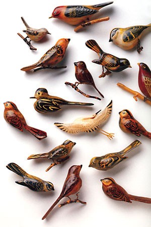
 These little wooden birds were carved by Japanese Americans during their internment in camps during World War II. The bird’s tiny legs are crafted from the surplus snipped off the wire mesh screens over barrack windows. In 2002, Delphine Hirasuna discovered a small wooden bird in a box of her mother’s, and she wondered what “other objects made in the camps lay tossed aside and forgotten, never shown to anyone because they might generate questions too painful to answer.” She’s collected an array of objects, from these birds to teapots carved from slabs of slate, umbrellas fashioned from cigarette paper and chopsticks, paintings on shells and rocks, and weavings of onion skin, and for the past few years, there has been a traveling exhibit of her finds. She’s also written a book: The Art of Gaman: Arts and Crafts from the Japanese American Internment Camps 1942-1946. (Click on this link to see spreads of the book, showing some of the crafts.)
 What’s this have to do with bookmaking you ask? I discovered Hirasuna’s book when reading this blog post where she discusses coming up with the title and cover jacket design for her book (which she says “proved as hard as developing the content”). It’s an interesting read.
And by the way, she also explains that gaman means “bearing the seemingly unbearable with patience and dignity.” There’s an NPR podcast about the exhibition here and an interview with Hirasuna here.


 At SFCB, I teach primarily beginning letterpress. Students have so much new stuff to learn —