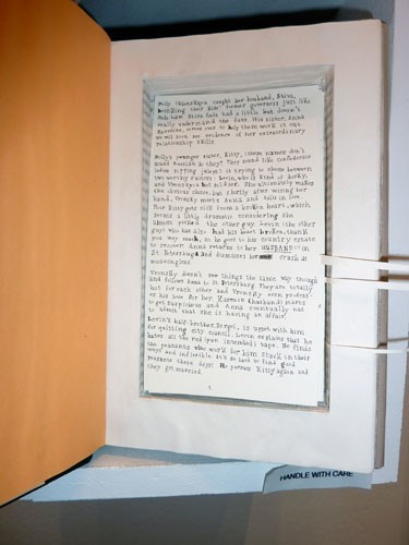
The Guild of Bookworkers traveling member exhibit, Marking Time, at the SF Main Library was pretty much equally divided between fine bindings (a rebinding and covering of a published book) and artists’ books. For the fine bindings, what was on display was everything the artist did — cover and endsheets. The artists’ books, for the most part, weren’t displayed nearly as well. The descriptions of the books gave tantilizing hints about what was inside, but the viewer was lucky to see even one page!

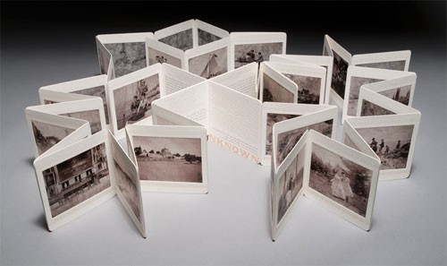
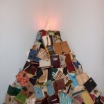
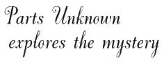 There was one glorious exception, though. Jessica Spring’s Parts Unknown was arrayed in its own case — opened wide so I could sit on the floor and see all the pictures and read much of the text. According to the description, the photos were “ink-jet printed on handmade abaca (and) varnished”, giving them a transparent quality that was quite fetching. But the fonts she used were the best part. The description says it’s all handset type, but don’t give the names, so I wrote Jessica and asked her what they were — she replied “The script is Dorchester (new from M&H) and the text is Packard (very dirty from my shop) and good old Copperplate. The bottom titling is wood type. Not enough of anything, so there was lots of setting and setting again!” That’s a sample of Dorchester above, see the entire font on fonts.com. Jessica’s book is pictured below. You can find out more about her on her website.

 Yesterday I met my friend Cathy up in San Francisco to see an exhibit called