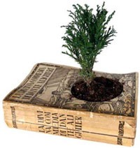
 Moving from California to New Mexico has been quite an adventure in patience! We knew from the beginning we would have to put our stuff in storage in California, go to New Mexico and get the house & studio ready, then come back to fetch everything. We thought the “get the house & studio ready” part would take a couple of weeks. How wrong we were! After many delays caused by bad weather and having to do a lot more work than anticipated on the studio to actually get it in shape for all my stuff, we finally set a move date — today! We’re back in California to oversee the loading, then we race back to New Mexico to meet the van. The van driver called yesterday to check that we were ready — and a stroke of luck: it turns out he used to earn his living as a printer and wanted to know all about my press, did I print from metal type, and what sort of things did I print!
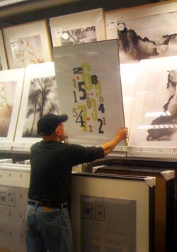
![]() While in California, we went to the local Ikea (none in New Mexico) to check out a sink for our bathroom. On the way out, I peeked into the framing/poster section, and there was my Ikea print! That’s a picture of my husband, arranging the print for my photo (how did we live without camera phones??) Hopefully later this week I’ll have more photos of the press being loaded, and, best of all, unloaded into its new home!
While in California, we went to the local Ikea (none in New Mexico) to check out a sink for our bathroom. On the way out, I peeked into the framing/poster section, and there was my Ikea print! That’s a picture of my husband, arranging the print for my photo (how did we live without camera phones??) Hopefully later this week I’ll have more photos of the press being loaded, and, best of all, unloaded into its new home!

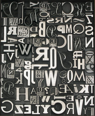 According to the OED, palaeotypographist means “An expert in early printing or typography.”