 Attached to the New Mexico History Museum here in Santa Fe is a print shop, with a sign on the door that says “exhibits of working frontier presses.” Among other things, they have a Vandercook and large C&P platen and lots of type. It’s a working press with 2 full time employees — they recently printed and handbound a book of poems by the Santa Fe poet laureate and the walls are full of broadsides. I’ve been meaning to go and check the shop out, especially to find out the local letterpress resources — can I get plates made locally? Where do they buy paper and ink? I just haven’t made time.
 When my friend Suzanne mentioned that there was a one day workshop there on reduction woodblock prints, I signed up immediately. First, so I would finally have to get to the print shop and get some of my questions about the local printing community answered. Second because I’ve been needing a push to experiment with the linoleum blocks I bought 2 years ago and have ignored.
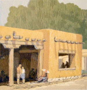
The class was last Saturday and taught by Denver-based artist Leon Loughridge — that’s one of his woodblock prints above — appropriately it depicts the Governor’s Palace in Santa Fe, which now houses the print shop where the workshop was held. On his website, Loughridge explains the reduction print method:
One block is used to create a multiple color print. The lightest color and the broadest area of the print is printed first for the entire edition, the block is then carved away leaving the next lightest color, which is printed. As the artist is continually removing material from the block to print the next color, the block is destroyed in the processes of making the image. The edition size is determined by how many acceptable impressions exist after the final color is printed.
There’s a nice example with photos of reduction printing on the Zum Gali Gali website.
It was a lovely day of both demonstration and hands-on cutting and printing and included a set of detailed notes. Loughridge uses a C&P like mine to print some of his editions. He doesn’t use rubber-based ink, but Caligo ink that he gets at McClains. It’s an oil-based ink that can be washed away with liquid soap and water (he used Simple Green). He creates texture on his prints using a pressure printing technique — he roughly brushes a piece of paper with gel medium, lets it dry and puts the sheet under the tympan. When he prints, the ink coverage is effected by the stipple created by the gel medium, to get a pattern like the light color in the tree foliage above. And the class worked the intended magic — I’ve already worked up 2 simple designs to practice carving and printing, and I’ve even drawn one on my abandoned linoleum blocks!