Archive for September, 2009

Bookish

Wednesday, September 30th, 2009

Book PyreYesterday I met my friend Cathy up in San Francisco to see an exhibit called Bookish at the back of a shop called Adobe Books in the Mission district. The front of the shop is chocked full of shelves of new and used books and a few comfy chairs for readers. On the way to the gallery space in the back, we passed a guy hunched over a typewriter, single-mindedly tapping away.
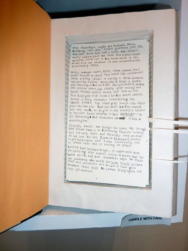
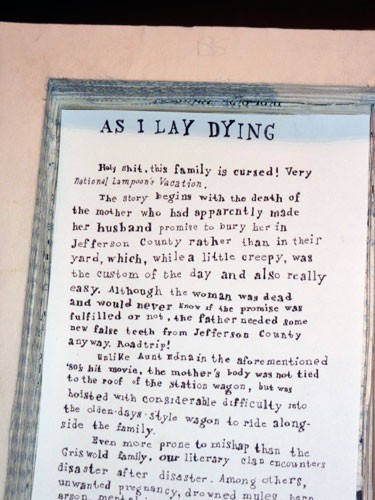
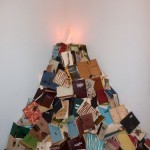
The exhibition space is small, but full of surprises. In the corner was a fake flame crackling on top of a pyre of books — which unfortunately had the wrong effect on me, as the noise was comforting, like a cozy fireplace to curl up beside to read a book. There were about half a dozen other works on display with the best being a small shelf with five “classical” books that viewers were invited to read. Turns out they each were hollowed out, and nestled in the removed space was a handwritten, very funny summary of, and running commentary on, the book’s plot. The artist is Jennie Ottinger. Below are images of 2 of the books — Anna Karenina, so you can see the structure (the tabs on the right help you to turn the pages). Below that you should be able to read part of the one we both particularly enjoyed, Faulkner’s As I Lay Dying.

Anna Karenina

As I Lay Dying


Marking Time Exhibit, part II

Tuesday, September 29th, 2009

The Guild of Bookworkers traveling member exhibit, Marking Time, at the SF Main Library was pretty much equally divided between fine bindings (a rebinding and covering of a published book) and artists’ books. For the fine bindings, what was on display was everything the artist did — cover and endsheets. The artists’ books, for the most part, weren’t displayed nearly as well. The descriptions of the books gave tantilizing hints about what was inside, but the viewer was lucky to see even one page!
Dorchester fontThere was one glorious exception, though. Jessica Spring’s Parts Unknown was arrayed in its own case — opened wide so I could sit on the floor and see all the pictures and read much of the text. According to the description, the photos were “ink-jet printed on handmade abaca (and) varnished”, giving them a transparent quality that was quite fetching. But the fonts she used were the best part. The description says it’s all handset type, but don’t give the names, so I wrote Jessica and asked her what they were — she replied “The script is Dorchester (new from M&H) and the text is Packard (very dirty from my shop) and good old Copperplate. The bottom titling is wood type. Not enough of anything, so there was lots of setting and setting again!” That’s a sample of Dorchester above, see the entire font on fonts.com. Jessica’s book is pictured below. You can find out more about her on her website.

Parts Unknown


Book Arts Jam 2009

Sunday, September 27th, 2009

Book Arts Jam 2009I’m participating again this year in the Book Arts Jam, a one-day regional celebration of the book and print arts, at Foothil College in Los Altos Hills, CA on Saturday October 17 from 10-4. The event features an exhibition of artists’ books, hands-on demonstrations, make-and-take activities, and an exhibitors’ showcase with work for sale by over 50 artists and craftspeople in the book, paper, and print arts. You’ll find a schedule, directions and a list of exhibitors here. If you get a chance to go, please stop by my table and say hello!


The Alphabetography Project

Friday, September 25th, 2009
Alphabetography BlogRhiannon sent me a link to The Alphabetography Project: A Study Of Letters, a blog where the authors “eat Alpha-Bits cereal, drink alphabet soup and watch Sesame Street for the letter of the day.” I quite enjoyed looking through their photos of found letters — the one to the right is for a radio station in NYC. Check out the blog here.

Marking Time Exhibit

Wednesday, September 23rd, 2009

My friend Sharon & I went to the Guild of Bookworkers traveling member exhibit, Marking Time, at the SF Main Library the other day. As we walked into the library, Sharon said “I’ve looked at the exhibit online, will it be any better in person?” The answer was decidedly mixed.
One of the books that hardly got a notice online mesmerized me in the case — Andrew Huot’s Walks with Rosie. What he says about it:

This book chronicles two weeks of daily walks with my dog in our Philadelphia neighborhood, marking the routes and occurrences on the way. The city is reduced to line, shape, and color, and transparent papers reveal the echoes of yesterday and an allusion to tomorrow.

The maps seem bigger in person, and the transparency made me pause and think about my own daily perambulations around town and my neighborhood. You can see more detailed images here or visit Huot’s website for more of his bookworks.

Walks with Rosie


Google Map Alphabet

Tuesday, September 22nd, 2009

Below are 2 letters from Rachel Young’s Alphabet, found using Google maps. You can see all of them here.

Alphabets in Google Maps


Green Chair Press is powered by WordPress
Entries (RSS) and Comments (RSS).