 Last year, when I learned how to use a laser cutter to make my pop-up book Fall, I wanted to see what else the cutter was good for and settled on cutting out wooden pendants in the shape of symbols or letters. Instead of a-z, I decided on ampersands and interrobangs. I looked at other punctuation and symbols too, including the pilcrow, after reading this post on the typographers Hoefler & Frere-Jones’ blog. (A pilcrow is the editor’s paragraph mark — it’s not really a backwards P, according to Hoefler “in its original form, the mark was an open C crossed by a vertical line or two, a scribal abbreviation for capitulum, the Latin word for ‘chapter.’ “) I cut out a few different pilcrows in several font faces and gave up, either unhappy with the way they looked (too much like a backward P) or the legs were so thin they snapped off…
![]() This morning I ran across one of those wooden pilcrow experiments in a dish I keep on my desk of odd pins and coins, and that led me back to reading Hoefler’s post again. And just as entertaining is his post on ampersands.
This morning I ran across one of those wooden pilcrow experiments in a dish I keep on my desk of odd pins and coins, and that led me back to reading Hoefler’s post again. And just as entertaining is his post on ampersands.
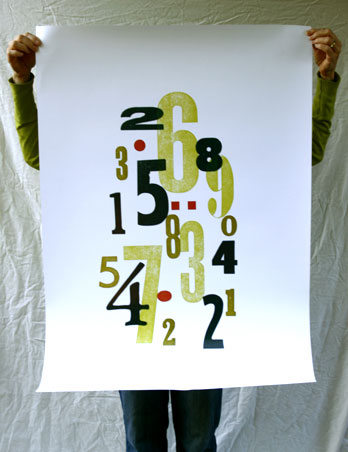 Last year a company in England that makes posters contacted me about proposing one of my wood type collages to Ikea… they would reproduce my original, make and supply the prints, I would get a royalty. I figured I had nothing to loose and sent off a proof for them to scan and forgot about it. Much to my surprise, Ikea selected my print, and in a huge size — almost 26×40. I got a proof the other day — that’s it to the right — and they should be available in Ikea stores in October!
 Another topic that seems to come up a lot around me recently is Twitter, specifically is it good for anything. I first checked it out last year when there was a wild fire near my sister’s house in Los Angeles — someone was posting updates about the fire, but calling my sister turned out to be much more informative (and accurate). Then this week there was a article in the NY Times about a woman who