Woven and Interlocking Book Structures

To A Friend Going Blind
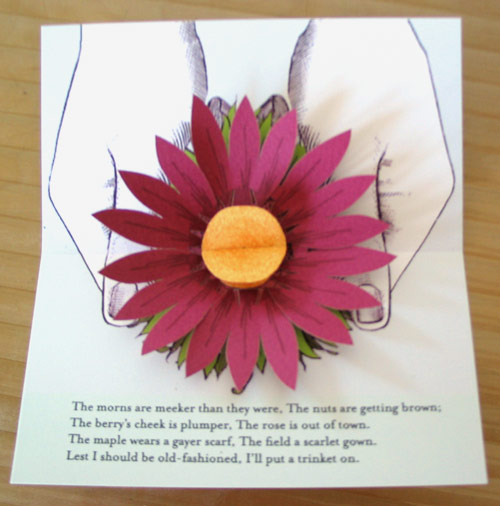
The most satisfying bookworks I’ve produced are my “poem books.” These contain a single poem and, most important, the structure of the book and the parts used to construct it compliment the words and content. Finding the right structure is a big challenge for me, the gestation of these books is usually long and the construction can sometimes be tricky. The book that has served as the inspiration for many of my “poem books” is Elizabeth Steiner and Claire Van Vliet’s Woven and Interlocking Book Structures. They approach bookmaking by first asking what is the best way to serve the text they are using — just the question I want to answer with my own work.
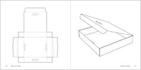
Their book includes detailed clear directions for making a variety of models, as well as
suggestions for seemingly endless variations. And they particularly tackle the problem of binding single sheets — an ever recurring issue for artist’s books. It has easy-to-follow directions, good illustrations and pictures, as well as discussions on how they developed structures to suit the content of their books. (You may know the book Van Vliet designed for the Margaret Kaufman poem “Aunt Sallie’s Lament,” a poem about quilting. The book was available in a trade edition from Chronicle Books with uniquely shaped pages that create a layered effect, mimicking the patterns of a quilt. You can see the original limited edition here)
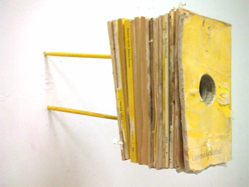
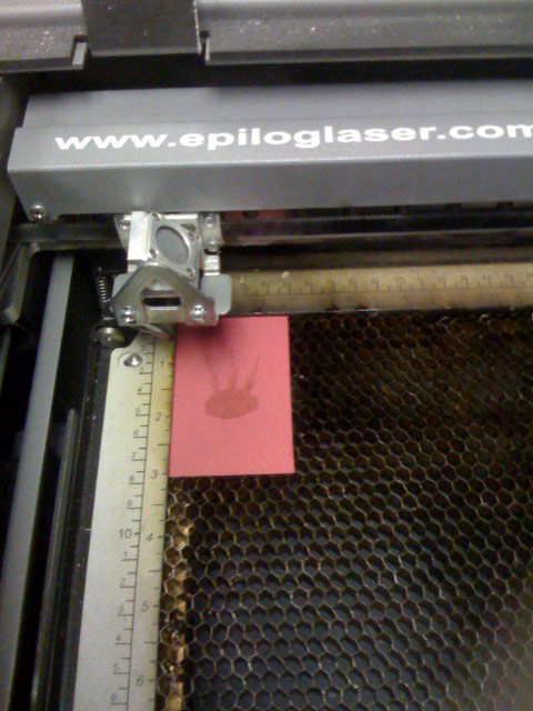
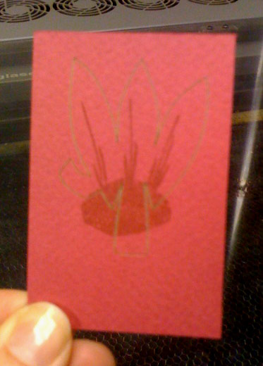
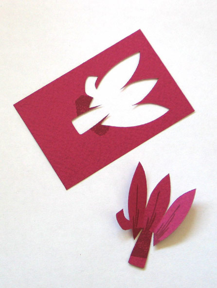
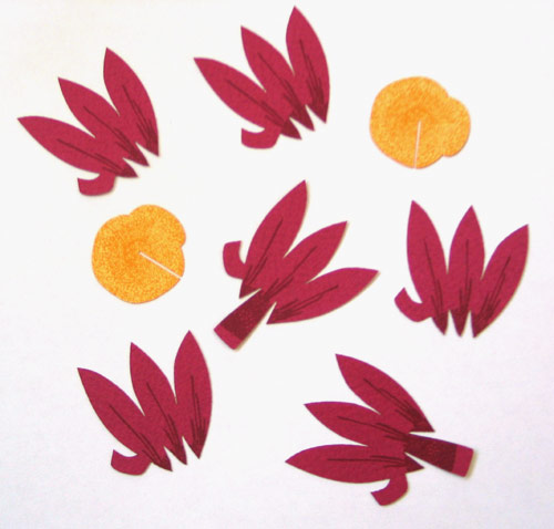
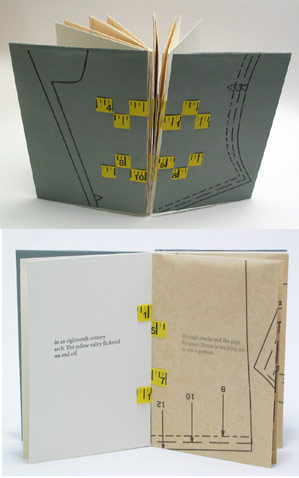
When I first got the book, I went through it and made every model — a satisfying hands on experience. Then a friend and I made an appointment at the Mills College Library Special Collection and saw their copies of many of Van Vliet’s books — an even more satisfying hands-on adventure! To top it all off Van Vliet came and taught a weekend workshop at the San Francisco Center for the Book, where she shared tips and tricks for making the structures in her book. By that point I had designed and begun editioning “To A Friend Going Blind, “ an artist’s book with a poem by Jorie Graham and bound using Steiner and Van Vliet’s simple method of weaving single sheets together (see the pictures above). It was a thrill to have the opportunity to show her a copy and get her comments! And she was kind enough to give me suggestions for making the book more quickly and strengthening a weak point in the construction — and then she bought one for her own collection!

A Bit of Eye Candy

A few book sculptures and a more practical book-ish idea….

Sarah Mizer’s birdhouse

One of Sarah Rebekah Byrd Mizer’s book sculptures. This one is byrd house, made from books and paint brushes.

Hubertus Gojowczyk’s book sculpture

Book sculpture by Hubertus Gojowczyk entitled Latest News from the Year 1732 and 1733

Book dividers

The website for these isn’t in English, but it’s a great idea for those with too many books, or who, like me, can’t seem to locate particular ones on the shelf.

Bookworks 2008

One reason I belong to the Pacific Center for the Book Arts is their triennial member show at the main San Francisco Public Library — I seem to need the exhibition deadline as incentive to complete a book. This time around (the show opens July 1) I’ve really procrastinated, but finally got going when my friend Sharon & I talked about what we could actually get done before the opening and she convinced me I was much further along than I thought. Today I’ll finish up my entry — which includes the pop-up book I wrote about in this post — and take pictures for my website before sending it off.
Once that’s done I’m looking forward to the best part of the show — the exhibition set-up on Friday& Saturday when I help Kate Godfrey photograph all the books. We did this together for the last show and besides the pleasure of hanging out with Kate, I get a personal look at all the books. Kate does most of the work, mind you, as she’s taking the pictures. As her assistant, I do lots of fetching and organizing and visiting with the other people actually installing the exhibit. And of course the best part: looking at and reading all the entries!

bookworks08-ecard.jpg

Lased

I’ve been wanting to design and make another pop-up book but the thought of all the hand cutting stops me dead. Then several months ago I found a place close to my home that rents time on all sorts of machinery — lathes, mills, fancy sewing machines that do embroidery, and something called a laser cutter. Book artist Julie Chen uses a laser cutter to make her intricate pop-up and layered books.
So I signed up to take a cutter class last Sunday morning. It was exhilarating and scary — the machine can cut and etch (or score) all sorts of materials, from paper to fabric to acrylic to wood. The instructor had even etched names into Triscuits! But you have to be really careful not to catch the material on fire (the scary part) since the cutting is done using heat.
I had a project in mind — a pop-up book that I had designed but set aside because it had more hand-cutting that I wanted to do. After the class I signed up to use the cutter on Tuesday morning. I figured if I signed up right away I’d both finish my project and not forget everything from the class. The instructor gave me some hints about registration (because of course what I wanted to do is covered in the ADVANCED class on using the cutter!) My plan was to print a design on paper that I would then cut into shapes, so the cuts and the design need to line up. A day and a half isn’t much time, so I pretty much worked non-stop getting prepped & ready.
I arrived at the appointed time on Tuesday morning totally over-prepared with lots of supplies and test sheets for set up and enough real printed paper for about 70 books (when I’m planning to make only about 40). And of course I didn’t need most of it. Instead, it was a rather uneventful couple of hours. It all went unbelieveably smoothly — I quickly got the machine set up and I spent the rest of the time inserting paper and watching the laser cut (took 2-3 minutes per 8-1/2″ x 11″ page). (And nothing caught fire!)

green-line-seperator.jpg

Here’s some pictures and such about my pop-up and the pieces I cut on the laser cutter. My book is called “Fall” and includes this poem by Emily Dickinson. (It’s the last in a series of books I’ve done about the seasons.)

The morns are meeker than they were,
The nuts are getting brown;
The berry’s cheek is plumper,
The rose is out of town.
The maple wears a gayer scarf,
The field a scarlet gown.
Lest I should be old-fashioned,
I’ll put a trinket on.

I wanted a pop-up that illustrated the last line — some sort of fall trinket — maybe a pop-up flower…

card-pieces-4.jpgcard-pieces-3.jpg
The picture to the left is one of my test sheets in the cutter before cutting. It cuts like a vector plotter (are those made anymore?) — the laser traces the outline of the object as if a phantom hand were drawing it. In the photo on the right, that grayish line is where the laser cut to form the petals for one part of the pop-up. The darker reddish color is the design I printed on my ink-jet. You can get a better idea from the photos below:

card-pieces-2.jpgcard-pieces-1.jpg
On the left is the petal detached from the sheet. On the right are all the pieces of the pop-up. And here’s a model of the finished piece using the laser-cut parts:

mockup-card.jpg
There’s more work to do… on the background graphic, letterpress printing the poem, and then it all has to be assembled. But the really time consuming hand-aching part is done!

Books on Books: Packaging It Up

packagedesign2.jpgOn my bookshelf I have several books on paper folding. One I especially like for inspiration is Structural Packaging Design — a book of patterns for making boxes and bags and displays. Fight Against InsomniaIt’s one of a series, my friend Cathy has How to Fold which has patterns for making envelopes and folders and brochures. Both books come with a CD of the patterns, so you can easily resize or tweak them. Over the past couple of years I’ve made most of the patterns in Structural Packaging Design, which has quite increased my technique and understanding of folding and 3D structures.
I was reminded of Structural Packaging Design earlier this week when I stumbled on Paper Foldables, a set of free figures that you “Print. Cut. Fold. Tape.” like the sheep to the right.

A Note on the Type

Netherland by Joseph O’NeillThis week I read Netherland, a recent novel by Joseph O’Neill. It’s about, among other things, cricket, and not books. But when I got to the end I was unexpectedly happy to turn to a page that contained only “A Note on the Type” and a wonderful note at that:

This book was set in a modern adaptation of a type designed by the first William Caslon (1692-1766). The Caslon face, an artistic, easily read type, has enjoyed more than two centuries of popularity in the English-speaking world. This version, designed by Carol Twombley for the Adobe Corportation and released in 1990, ensures by its even balance and honest letterforms the continuing use of Caslon well into the digial age and the twenty-first century.

Used to be most books had such notes, wish they still did.