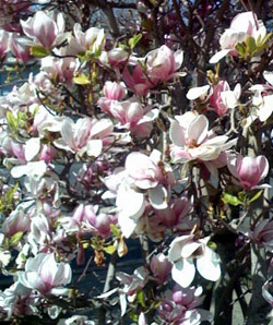
 The weather has turned warm here in Northern California (that’s the magnolia tree in my front yard) and I’ve been outside as much as possible. But no one ever seems to want to enjoy the season at hand — my mailbox is full of enticing summer bookmaking programs, making me want to skip right to July.
![]() The Wells Book Arts Center in upstate New York has three week-long sessions, with intriguing titles like “Moving Parts: The Book as Kinetic Sculpture” taught by Dolph Smith and “Considering Text and Image” taught by Inge Bruggeman. A brochure is available here.
The Wells Book Arts Center in upstate New York has three week-long sessions, with intriguing titles like “Moving Parts: The Book as Kinetic Sculpture” taught by Dolph Smith and “Considering Text and Image” taught by Inge Bruggeman. A brochure is available here.
![]() A new intensive debuts this year in England, at Wellington College in Berkshire, organized by two teachers well known here in the Bay Area — Dominic Riley and Michael Burke. You can find out all about it on their website.
A new intensive debuts this year in England, at Wellington College in Berkshire, organized by two teachers well known here in the Bay Area — Dominic Riley and Michael Burke. You can find out all about it on their website.
![]() Anyone know of any more?
Anyone know of any more?
 Last week I saw the documentary