 For the past several years, the Pacific Center for the Book Arts has sponsored a year-end show of calendars created by members. The theme the first year was “marking time.” That first year I started to design a calendar but got stuck trying to figure out what “marking time” meant for me. I dislike the rigidity of calendars, but I’m a notorious list maker — just as rigid as keeping a datebook I guess. So the second year I incorporated my list-making habit into my calendar entry with a diary for readers. It’s a slim little book that lets you record and rate the books you read. Maybe not traditional, but it does mark time.
 By last year I had stopped worrying about the marking time business and was ready to do something that looked more like what most people think of as a calendar. I wanted to incorporate letterpress into my design, but I didn’t get started until November. So I designed and letterpress printed a flat 5″x7″ card with a quote on the top and the months on the lower half. This card motivated this blog — my adventures designing broadsides.
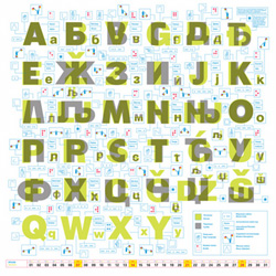
This year I’ve started earlier with the idea of a calendar that sat on a desk or table, in a propped open jewel case, with one page per month. And it would include some haiku that I’ve been writing. But first I had to get very distracted by some other interesting calendar designs, none of them in English. The Publikum Calendar, published by a Serbian design company, is glorious (there’s more about it here). And this sprial calendar appeals to my notion that time is continuous rather than discrete day-to-day chunks.
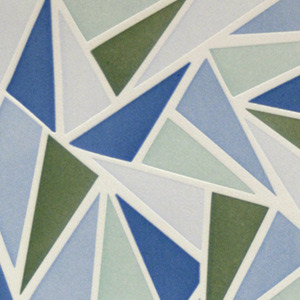 I’ve been looking at Chinese latticework designs recently and thought some of the patterns would adapt well to a letterpress print. The designs are clean and simple, and greatly enhanced with color. I had already selected a colorway for this pattern when I noticed that the agapanthus in our front yard were almost finished blooming. I always love the spikey blue flowers on long skinny stalks, and decided to ditch my original plan and use the blues and greens from the fading plants.