And To-morrow

Lisa Rappoport’s calendar

I’m printing my 2008 calendar design on my hand-feed, manually operated (using a foot treadle) letterpress printer. The calendar has 14 pages, 2 colors each. This ends up to be a lot of feeding and a tremendous amount of treadling. It’s not a particularly mindless task, as I have to pay attention so that my hands don’t get caught as the platen opens and closes, that the paper is straight, and most importantly that the ink is consistent across pages. Once I get a rhythm going, though, it turns out to be a pleasant way to spend an afternoon, especially with a bit of music on the radio or through my ipod.
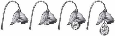
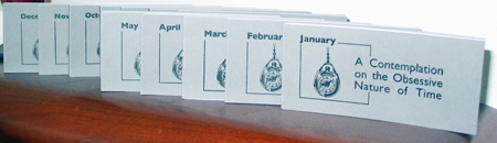
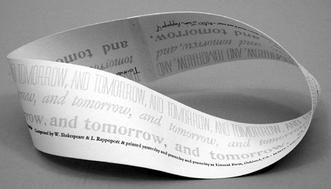
While printing I’ve been thinking about calendars I’ve particularly liked. The one pictured in this post is by Lisa Rappoport of Littoral Press from 2005. It’s really more of a mediation on time, I guess, and it perfectly matches that repetitious feel that I have spending my afternoons treadling. (Kate Godfrey took the picture.)

To-morrow, and to-morrow, and to-morrow,
Creeps in this petty pace from day to day,
To the last syllable of recorded time;
And all our yesterdays have lighted fools
The way to dusty death. Out, out, brief candle!
Life’s but a walking shadow; a poor player,
That struts and frets his hour upon the stage,
And then is heard no more: it is a tale
Told by an idiot, full of sound and fury,
Signifying nothing.
Macbeth (V, v, 19)

Synesthesia

Synesthesia“Synesthesia” means one sensory experience described in terms of another sensory experience, such as hearing colors or seeing notes. When I was a kid and learning arithmetic, I would get confused and think “5+2=green” or “5+4=purple”. But just as we memorize multiplication tables, I memorized 5+2=7. It wasn’t until I was an adult that I knew there was a name for my confusion (there’s even a sub-genre called “grapheme” for perceiving numbers or letters as inherently colored). I still occassionally get confused though, and as I was printing my latest wood type collage, I noticed that I was thinking of number pairs in terms of colors. So “synesthesia” seemed like a good title for this one.

Printy Quotes

Books finely printedI keep a notebook of quotes and poetry that I scour for titles for my broadsides. Juliet, over on the muddy island, sent me a link to a lovely site with quotes about printing: the cavendish gallery of print and typography. It pairs the quotes with printing-related images.
The gallery doesn’t include one of my favorite quotes, so on the right is my own addition, paired with my favorite printer.
And below is the text from the gallery entry with a phrase that inspired the title for one of my recent wood type collage broadsides, Safe Ground.

This is a printing office.
Cross-roads of Civilization,
Refuge of all the Arts against the Ravages of Time.
From this place Words may fly abroad
Not to perish as Waves of Sound
But fix’d in Time,
Not corrupted by the hurrying Hand
But verified in Proof.
Friend, you stand on Safe Ground:
This is a printing office.

Teacher Features: Bookmaking with Kids

Making Whale Tail BooksRecently I helped Cathy Miranker set up a blog about bookmaking with kids. She launched it just as the new school year is starting but already it’s got lots of ideas for making books with kids. Projects are tagged by age and grade level, and there’s a “calendar of ideas” with bookmaking opportunity prompts. And it’s not just about physically making books — the books encourage kids to write stories, read, draw, even present dramatic readings! Take a look here.

Obsessive Nature of Time

A Contemplation of the Obsessive Nature of Time
This week I started printing my 2008 calendar design. I’ve already printed my Christmas cards and some winter coasters. My obsessive pre-planning has the effect of making me feel as though I’ve skipped much of summer and fall and catapulted myself into winter!
Of course I’m not the only one who’s obsessive! Last year, Nikki Thompson of Deconstructed Artichoke Press made a bookwork for the PCBA Calendar Show called “A Contemplation of the Obsessive Nature of Time.” It’s 12 flipbooks, one for each month, based on prose writings by Julio Cortazar: “Preamble to the Instructions on How to Wind a Watch” and “Instructions on How to Wind a Watch.” She decided that the repetitive nature of a flipbook structure was the best for communicating obsessiveness and said, “originally I was thinking about using minutes or seconds in a year as the constraint for the number of flipbooks and the number of pages per flipbook, but practically speaking it was too obsessive, so I chose the twelve flipbooks, ranging from 28 to 31 pages.” I immediately bought a copy, not only because of the subject but it’s a wonderful way to think about the year rather than as structured set of days and weeks and months.
The images above are from the December flipbook. And below, my copy of her books spread out on my shelf. At the end of this month, Nikki is teaching a class in calendar making, “Handmade Calendars: From Concept to Completion,” at the San Francisco Center for the Book. Be sure to check it out!

A Contemplation of the Obsessive Nature of Time

Merit Badges

Pod Post SashI was a girl scout through high school and I still have my sash with the badges I earned for things like camping, backpacking and baking. Imagine my delight last Saturday at the SFCB Roadworks craft fair when my friends Jennie and Carolee, of Pod Post, showed up with their new merit badges for letterpress! I immediately bought a set and today I’ll sew them on my printers’ apron.
That’s Carolee on the right, modelling her sash with another set of their badges — these for bookbinding. They also have a set for zine making.
The letterpress badges are labeled “Level One: Set Type’, ‘Level Two: Mind Your P’s (and Q’s)’ and ‘Level Three: Press Time’. Carolee said I could wear the Level Three badge, even though I print on an inferior C&P floor model and not the coveted (and pictured) Vandercook!

Pod Post Merit Badges