Like a Library, But More Interesting?

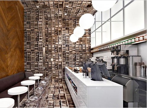
I had to laugh at this article about the decor in D’Espresso’s coffe bar in NYC. According to the article, the owner “told his designer, ‘Let’s do a coffee bar that looks like a library, but would be more interesting.’“ So the designer made a room tipped on its side — one wall is covered in oak flooring, the ceiling, floor and rear wall are tiled with an image of bookshelves (on their side). Is that “more interesting?” Cute maybe, but much as I like coffee, guess I’d rather go to a real library… (Photo below by Elaine Louie.)

D’Espresso in NYC by ELAINE LOUIE

Jane Austen Coasters

Jane Austen Coasters — Green Chair PressI’ve been printing a few new coaster designs, and this is the first one — a set of quotes from Jane Austen. 9 coasters, 3 quotes.

Printed in brown, the quote from Pride and Prejudice is “There is a stubbornness about me that never can bear to be frightened at the will of others. My courage always rises at every attempt to intimidate me.”

Printed in green, the quote from Emma is “It is always incomprehensible to a man that a woman should ever refuse an offer of marriage. A man always imagines a woman to be ready for any body who asks her.”

Printed in purple, the quote from Northanger Abbey is “It would be mortifying to the feelings of many ladies, could they be made to understand how little the heart of man is affected by what is costly or new in their attire.”

See more here.

Tramps

Tramps, A Miscellany of Printers Portraits by Dan Wood and Katherine Cummings

The above print is “Tramps! A Miscellany of Printers Portraits” — a limited edition two color letterpress print by Dan Wood and Katherine Cummings. They used images selected from the hundreds of recently scanned printers portraits at the Daniel Berkeley Updike History of Printing Collection in the Providence Public Library and focuses on early printers of the 15th and 16th centuries, with Benjamin Franklin and a few other later eccentrics thrown in for good measure.

Available for sale here. First seen on the printeresting blog.

Side note: The Providence Public Library Special Collection has a nice blog called Notes for Bibliophiles.

Erotica Botanica

Erotica Botanica, May Day PressI met book artist and printer Catherine Michaelis at a book fair in Seattle in 2004. We’ve swapped a few of our books and I’ve been following her on her blog. She recently finished a book for the Sandy Gallery’s Pop-Up Now! A Juried Exhibition of Movable Books. Catherline says of her book

Enter the sensual Erotica Botanica through an unfolding caress of its leaf shaped pages. Delicate flowers with enticing organs float up from the folds above a bed of leaves and seed pods. Erotic verse, written by flowers and pollinators, inspires the viewer to contemplate the sexual desire of plants.

One of the poems is

Bandy-legged bumble bee
your furry belted belly
tickles me

On her blog, she wrote several posts about her inspiration for the poems, the images and shapes. You can see them here (unfortunately, you have to read the posts backwards, probably my biggest complaint about blogs!).

Bookmarks

Bookmark winner: Arya, Grade 2, NJI spoke to a book friend from San Francisco this past week, who mentioned that she’d gone to Roadworks, the annual Fall fund raiser and print making event at the SF Center for the Book. A few days later while unpacking yet another box I found a bookmark — moving & remodeling has meant a constant shift of boxes from one room to another, or one side of the hall to another, as we slowly finish off the various rooms. It’s always gratifying to empty a box and put its contents away, collapse the box and put it in the recycling pile! But back to my story — I think the bookmark was from a Roadworks several years ago where my friend Cathy provided book-ish activities for kids. At this one, she had them design bookmarks. Mine has a jaunty ballerina all in pink, pirouetting. I pinned her to the cork board behind my computer. That very day I saw a mention somewhere for the National Book Festival — “a celebration of the joy of reading for all ages” that took place on the Mall in Washington DC on Sept 25. I checked out their website and was immediately drawn to the Borders Bookmark Contest where children across the country designed bookmarks to convey their love of reading. The one to the left is by Arya, Grade 2, NJ. You can see the winners from each state here. There are also podcasts of the speakers at the event on the Mall — ranging from author Isabel Allende to poet Rae Armantrout.

2011 Calendar

2011 CalendarYeah — I’m all done. Here’s my 2011 calendar…

listening around the bustle,
delighting in the commonplace—
the rest is noise.

For me, much of what makes life great is the series of simple encounters and observations I have every day — from the smell of freshly dug dirt in my garden to watching the birds at the feeder outside my bedroom to catching a glimpse of a saffron colored sky at sunset.

The calendar has 12 unbound cards, one for each month of 2011, celebrating those commonplace moments with a haiku and a pattern. It comes housed in a plastic case that doubles as a display stand.

Ten of the months are letterpress printed on a hand-fed (and foot treadled) vintage 1890s platen press on plush off-white cotton paper. April and September are printed on Japanense paper (moriki) and the design is hand-marbled with a technique called suminagashi. These two months are unique to each calendar. All the months are pictured below — click here to see a much larger photo. You can order a copy here.