|
|
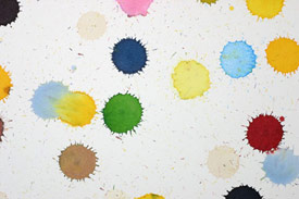
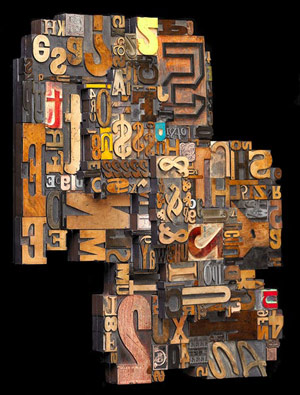
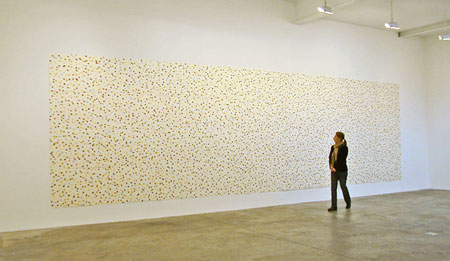
Abecedary (Nabokov’s Theory of a Colored Alphabet applied to Heisenberg’s Uncertainty Principle) (detail) by Spencer Finch. Uses Nabokov’s system of a colored alphabet to transliterate 9,251 characters from Heisenberg’s text. [Click on the image to see the entire painting.] |
I’m gotten several emails about my blog post on my wood type collage Synesthesia, why I chose that title, and my own confusion between numbers and colors. The most recent email recommended I look at Spencer Finch’s painting Abecedary, now at the Massachusetts Museum of Contemporary Art, with the intriguing subtitle “Nabokov’s Theory of a Colored Alphabet applied to Heisenberg’s Uncertainty Principle.”
 That subtitle took me off on a happy hour of Google searching for Nabokov’s theory. It turns out Nabokov (who is famous for writing, among other things, Lolita) had synesthesia and wrote about it in his autobiography Speak, Memory (that’s the theory quoted below). Then I found the book Alphabet in Color which, according to one reviewer “showcases what Nabokov heard with respect to colors would manifest visually to the rest of us with charming, vibrant, synesthetic colored letters.” As seems to be usual in cases of obscure books, it’s not available at my library or a local bookstore, but one of the pages is shown below. You can read Brian Boyd’s interesting intro to the book here. (The title of this post is taken from a line in Nabokov’s book Ada or Ardor — the end of the Nabokov quote below explains how to speak in the language of rainbows.)
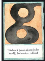 “I present a fine case of colored hearing. Perhaps “hearing” is not quite accurate, since the color sensation seems to be produced by the very act of my orally forming a given letter while I imagine its outline. The long a of the English alphabet (and it is this alphabet I have in mind farther on unless otherwise stated) has for me the tint of weathered wood, but a French a evokes polished ebony. This black group also includes hard g (vulcanized rubber) and r (a sooty rag being ripped). Oatmeal n, noodle-limp l, and the ivory-backed hard mirror of o take care of the whites. I am puzzled by my French on which I see as the brimming tension-surface of alcohol in a small glass. Passing on to the blue group, there is steely x, thundercloud z, and huckleberry k. Since a subtle interaction exists between sound and shape, I see q as browner than k, while s is not the light blue of c, but a curious mixture of azure and mother-of-pearl. Adjacent tints do not merge, and diphthongs do not have special colors of their own, unless represented by a single character in some other language (thus the fluffy-gray, three-stemmed Russian letter that stands for sh, a letter as old as the rushes of the Nile, influences its English representation).
I hasten to complete my list before I am interrupted. In the green group, there are alder-leaf f, the unripe apple of p, and pistachio t. Dull green, combined somehow with violet, is the best I can do for w. The yellows comprise various e‘s and i‘s, creamy d, bright-golden y, and u, whose alphabetical value I can express only by “brassy with an olive sheen”. In the brown group, there are the rich rubbery tone of the soft g, paler j, and the drab shoelace of h. Finally, among the reds, b has the tone called burnt sienna by painters, m is a fold of pink flannel, and today I have at last perfectly matched v with “Rose Quartz” in Maerz and Puol’s Dictionary of Color. The word for rainbow, a primary, but decidedly muddy, rainbow, is in my private language the hardly pronounceable: kzspygv. ”
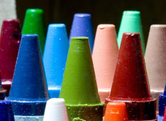 As a kid, courtesy of my large box of Crayola crayons, colors were synonymous with words: apricot, almond, goldenrod… (of course
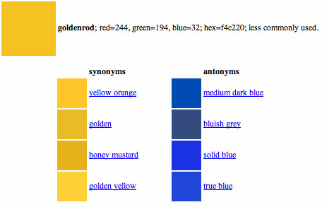
