 Like many craftspeople, I have a shelf full of resource books. Some are how-to books, some are exhibition catalogues, there are books about binding, type, and different art techniques. I also count my collection of artists books as “resources” as I often use them, as I do those other books, for inspiration. I have a how-to book with instructions I’ve rarely used, but I turn to its picture gallery often to help me when I’m stuck and need ideas for another book structure or a variation to experiment with.
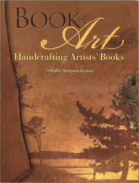
![]() Dorothy Krause’s new book, Book + Art, Handcrafting Artists’ Books is a cross between a how-to and an exhibition catalogue. In particular its photos are a glorious showcase of Krause’s work. While she talks about bookmaking, her subject is really how to use the book format, and even pre-made books, for your artwork in one-of-a-kind books. Her use of books began as a substrate for her prints and other oddments when she traveled. She says in the introduction “my early books allowed me to explore repetition and variation in a small format…I have focused on learning traditional book-making processes and adapting them to meet my needs as an artist.”
Dorothy Krause’s new book, Book + Art, Handcrafting Artists’ Books is a cross between a how-to and an exhibition catalogue. In particular its photos are a glorious showcase of Krause’s work. While she talks about bookmaking, her subject is really how to use the book format, and even pre-made books, for your artwork in one-of-a-kind books. Her use of books began as a substrate for her prints and other oddments when she traveled. She says in the introduction “my early books allowed me to explore repetition and variation in a small format…I have focused on learning traditional book-making processes and adapting them to meet my needs as an artist.”
![]() Unlike the other bookmaking books on my shelf, Krause includes instructions for many printmaking techniques, from gelatin monoprints to inkjet and image transfers. And the book does pass the inspiration test: a friend and I were talking about what sort of structure to house her small, sewn paper collages, and Krauses’ book yielded a good suggestion for her to try.
Unlike the other bookmaking books on my shelf, Krause includes instructions for many printmaking techniques, from gelatin monoprints to inkjet and image transfers. And the book does pass the inspiration test: a friend and I were talking about what sort of structure to house her small, sewn paper collages, and Krauses’ book yielded a good suggestion for her to try.