 Several weeks ago, my friend Kate suggested that I try making a mini book (a 3.75″ x 2.5″ photo-book) on Lulu, the print on demand self-publishing site. At the time, I did a cursory look & thought the price ($3.99 for a 20 page book) might be cheaper than what I could make such a book for using the equipment in my studio (and probably much less aggravating). Printing photos or even color illustrations is always the biggest issue for me whenever I make a full-color book — the paper choices for my ink jet aren’t very nice (must be coated paper which doesn’t fold very well and the coating makes the paper too white for my taste, so it’s got to be covered completely with ink) and the ink is expensive. While I’ve made an uneasy peace with my ink jet, it can be very ornery — especially the times it sprays bits of black ink over parts of a page, rendering the output useless. So I’m always interested in new ways to print full color pages for my small editions (25-50 books).
 Since Kate’s suggestion, I’ve framed a bit of an experiment. One of my first books was a very short story I wrote and illustrated about my first year of ballet class. The original version was 5″x7″ with thick Davey board covers, and a single pamphlet sewn signature. I used Mohawk Superfine Text, a nice cotton paper that isn’t coated but the results from printing my drawings and minimal text with the ink jet are tolerable. Recently someone in my ballet class reminded me of that book and asked to get a copy. I’ve had it on my never-ending to-do list to make a few and decided to use Lulu to print them (reformatted to the smaller 3.75″x2.5″ size). I’ll also make 2 by hand — one using coated paper and the other using Mohawk Superfine Text. I’ll compare the price to make each book as well as their look and feel.
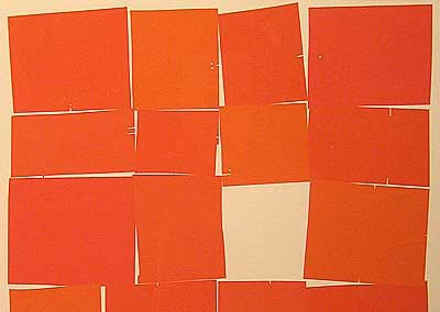
 That’s one of the spreads from the reformatted book, at the top of this post. I’ll report back in a few days about using Lulu.

 From the article by John Carlos Cantu:
 Several weeks ago, my friend Kate