The Certainty of Numbers

Kat Ran’s 10th book, The Certainty of Numbers

April is both National Poetry Month and Mathematics Awareness Month. (This year “awareness” is related to climate and climate change, but I suppose I’m more aware of numbers in April because of US tax day on April 15, but I digress…)
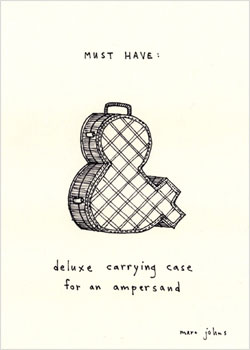
The other day I got an announcement from Kat Ran Press about their latest chapbook, with a quite wonderful poem, perfect for both celebrations — The Certainty of Numbers by Bruce Snider

The Certainty of Numbers

It’s not the numbers you dislike—
the 3s or 5s or 7s—but the way
the answers leave no room for you,
the way 4 plus 2 is always 6
never 9 or 10 or Florida,
the way 3 divided by 1
is never an essay about spelunking
or poached salmon, which is why
you never seemed to get the answer right
when the Algebra teacher asked,
If a man floating down a river in a canoe
has traveled three miles of a twelve mile canyon
in five minutes, how long will it take him
to complete the race?
Which of course depends
on if the wind resistance is 13 miles an hour
and he’s traveling upstream
against a 2 mile an hour current
and his arms are tired and he’s thinking
about the first time he ever saw Florida,
which was in the seventh grade
right after his parents’ divorce
and he felt overshadowed
by the palm trees, neon sun visors,
and cheap postcards swimming
with alligators. Nothing is ever simple,
except for the way the 3 looks like two shells
washed up on last night’s shore,
but then sometimes it looks like a bird
gently crushed and on its side.
And the 1—once so certain
you could lean up against it
like a gray fence post—has grown weary,
fascinated by the perpetual
itch of its own body.
Even the Algebra teacher
waving his formulas like baseball bats,
pauses occasionally when he tells you
that a 9 and a 2 are traveling in a canoe
on a river in a canyon. How long
will it take them to complete their journey?
That is if they don’t lose their oars
and panic and strike the rocks,
shattering the canoe. Nothing is ever certain.
We had no plan, the numbers would tell us,
at the moment of our deaths.

Flexagons

Britta Gustafson’s Map FlexagonThe other day my friend Cathy sent me to Britta Gustafson’s blog post about her flexagon — a map of three summers in the Bay Area. [If you don’t know about flexagons, they are similar to Jacob’s Ladder toys — flat “books” made from folded paper that are then unfolded, or flexed, to reveal a number of hidden faces. Wikipedia gives the history and probably more than you want to know…] Britta’s post has great pictures plus an animation toward the bottom showing the various panels on the book. Cathy knew I’d like the post because it’s both map & book related. I like that each flex of the flexagon becomes more specific.
Cathy’s email reminded me about the “10 Books in 2 Days” classes Cathy organized several years ago to celebrate the 10th anniversary of the San Francisco Center for the Book. She set up 5 stations a day, each with a different book structure or printing method and different instructor; participants rotated through the stations doing each activity. I was charged with designing a flexagon that participants could make. I found two resources that were a great help — Ed Hutchin’s instructions that number the panels so you can tell if you’ve made the thing correctly when you try to flex the panels, and the Flexagon Portal with more instructions and videos and how-tos for making various shaped flexagons. Ed also has a page of examples with pictures of all the panels.
If you’d like to try to make one, download this PDF of “A Bookmaker’s Bag ‘o Tricks” flexagon I designed for Cathy’s event. It’s 2-sided and has 2 flexagons. The top half is for practice, with the numbers as on Ed’s instructions. Once you’ve mastered the folding, use the bottom half to make the flexagon.

ABCs

Detail of Blue AlphabetThe biggest print I can make on my platen press is about 8×10. I’ve been itching to do something larger, but fitting a bigger press in my shop just isn’t practical. So I decided to try out the Vandercooks at the San Francisco Center for the Book where I teach. These are cylinder presses and I’ve only used them a few times. I arranged to print the same day as my friend Melissa, who had agreed to give me a quick refresher — how to clean the press, differences to watch out for between a platen and cylinder model. I took with me a design I’d done but had trouble printing on my own press — it fits on an 8×10 sheet but the image area is too big to get good ink coverage from my platen. The Vandercooks printed it beautifully — with a nice deep impression, so the Q and V and dot of the I in the prints below stand out. I especially like this design because I got to use the “AND” from the Adobe Wood Type Ornaments! I printed some in 2 different colors and they are available here.


Green Alphabet   Blue Alphabet

Type Buildings

Detail of Font Church by Cameron MollVeer’s playful typeface catalog is called Type City: A Visitor’s Guide — along with examples of their types they include whimsical illustrations of buildings and cityscapes made of type (see the red “Bringhurst Hotel” below). Inspired by the catalog, Cameron Moll designed an elaborate print from Bickham Script, Engravers MT and Epic of the Salt Lake Temple in Utah (detail of the top of the spire on the left, then more below). Photos showing the printing are here. The Veer catalog PDF is available here. And the print is for sale here.

Font buildings