Mind Your Ps & Qs

Mind Your Ps & QsNo one seems to know exactly where the idiom “mind your Ps and Qs” originated, but I’d like to believe that it came from advice to typesetters. In letterpress printing, words are composed metal type letter by metal type letter, left-to-right, with each letter inserted upside down. For beginning typesetters, backward-facing letters are confusing, especially the mirrored lower-case letter pairs p and q, and b and d. And thus the advice to be alert and watch the details (“mind the ps and qs”).
In addition to the typesetting theory, there are many competing explanations — my favorite: an admonishment from a French dancing master to perform the dance figures pieds and queues correctly. Others include a variation on the typesetter advice, but to small children learning to write the alphabet, not to mix up p and q.
This article gives some more possible origins and then clears up the mystery: “Investigations by the Oxford English Dictionary in 2007 when revising the entry turned up early examples of the use of Ps and Qs to mean learning the alphabet. The first is in a poem by Charles Churchill, published in 1763: ‘On all occasions next the chair / He stands for service of the Mayor, / And to instruct him how to use / His A’s and B’s, and P’s and Q’s.’ The conclusion must be that this is the true origin.”
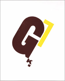
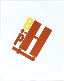
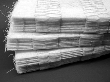
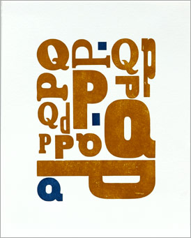
In my current project to feature my large wood type in my printing, my newest broadside uses only Ps and Qs. That’s it above.

Judging a Book by its Cover

Pelican book covers by yearRecently I found a wonderful-to-look-at pictorial archive of Pelican book covers by year. Pelican is the non-fiction brand of Penguin Books and, according to Wikipedia, the idea behind the first paperback Penguin Books was to “provide quality writing cheaply, for the same price as a pack of cigarettes.” The publisher decided that design was essential to Penguin’s success, so the first covers, from the 1930s, were simple layouts that used two colors and Eric Gill’s sans serif for the typeface (like the “Ariel” cover to the right). Over time images and illustrations were added to the cover designs. As you might guess, I especially like the one for “Riddles in Mathematics” from 1953. See the entire archive here and read a good article about the history of Penguin’s book design on the Design Museum website.
One more nerdy bit for those like me interested in book design and page layout: Jan Tschichold was the designer at Penguin from 1947-49. He fashioned a template for all Penguin books called Penguin Composition Rules, a four page booklet of typographic instructions for editors and compositors. You can read them here. Jordon Harper adapted them to web writing here.

Paper Cutting

Pistoles PressPaper cuts seem to be all the current rage — from Kara Walker at the Whitney in NY to shops on Etsy including Mister Rob, to traditional Chinese designs from jinshanghai, to Pistoles Press (image to left) where Lana incorporates her paper cuts into books.
While I’ve done a fair amount of hand cutting when making pop-up books, I’m a beginner to these more intricate forms. There are quite a few books on paper cutting techniques on Amazon. Online, Lana at Pistoles Press writes about her methods for making paper cuts and wood block prints on her blog. And check out this nice online tutorial on Skinny Laminx’s blog.

Ghost Books

v25no1cover.jpgIn addition to running Green Chair Press, I’m the current editor of the Pacific Center for the Books Arts (PCBA) quarterly journal Ampersand. PCBA began as a regional (San Francisco-based) organization 25 years ago, to support professional development of book artists, but we’ve grown to have many members across the US and beyond. In the issue that came out this week, I’m excited to have three articles about artists from California to Florida using fabric and fiber in their bookworks.
Mentioned in several articles is Santa Cruz-based Jody Alexander and her ghost books made out of mull (a stiff muslin open-weave fabric that is used by bookbinders to cover the spine of books). Deborah Kogan, who interviewed Jody for Ampersand, says “When I saw the books … they exploded my preconceived ideas about fabric books. I had been thinking of fabric books as fluffy and plump. Alexander’s books are exactly the opposite—they remind me of skeletal remains after every shred of flesh has been boiled away or removed after long exposure to the elements.”
I got to see Jody’s ghost books this week in person as part of the current exhibition at the San Francisco Center for the Book (through the end of April). They are indeed quite ethereal and eerily beautiful! The photograph below is of Jody’s Signs of Life I,II, & III. You can see more of Jody’s one-of-a-kind bookworks on her website.

Jody Alexander’s Signs of Life I, II, III

Hand Debossed Panels

One of the first classes I took at the San Francisco Center for the Book was to make an accordion spine book with a hand-debossed (recessed) panel in each page. For that class (taught by Howard Munson) we made collages to put in the debossments. I’ve used this debossing technique many times since then, mainly for cards but most recently for my newest set of broadsides. It’s a much more elegant way to display artwork or photographs than just gluing them onto the paper.
To make a hand-debossed panel, you’ll need a bone folder and a piece of davey board (or something that is about 1/8″ thick) cut to the size of the panel. The paper to be debossed should be thick and soft (for instance Somerset or Rives). I make a jig by cutting a piece of card stock to the size of my paper, figuring out where the debossed panel should be located, and attaching the davey board there using double-stick tape. (You can see the jig in the photo below.)

handdeboss1.jpg

Now I lay my paper over the jig, lining up the edges at the top and side. I put a piece of double-stick or rolled tape on the davey board, so that once I’ve lined everything up, I can tack the paper down so it won’t move. To start the debossment, using my fingers, I carefully press the paper against the sides of the davey board. Then, using my bone folder, I work the paper against the davey board. This molds the panel into the paper. Do this slowly at first, as it’s easy to tear or mark the paper. Pay careful attention to the corners.

handdeboss2.jpg

When all the sides and corners have been worked equally, I’m done.

handdeboss3.jpg